Designing Fun
“Make it fun!” — when it comes to UI/UX design, having an enjoyable interface seems to be more important than ever. A fun web or app experience is not only a gimmick, but a real product differentiator. But what makes interfaces fun?
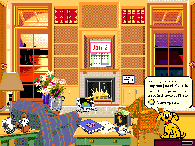
Let’s start with a common misconception: Fun is not funny. Fun has nothing to do with telling people jokes, having cool animations or quirky characters. Fun interfaces are no cartoon versions of an interface, they are not immersive worlds and by no means they are Microsoft Bob.

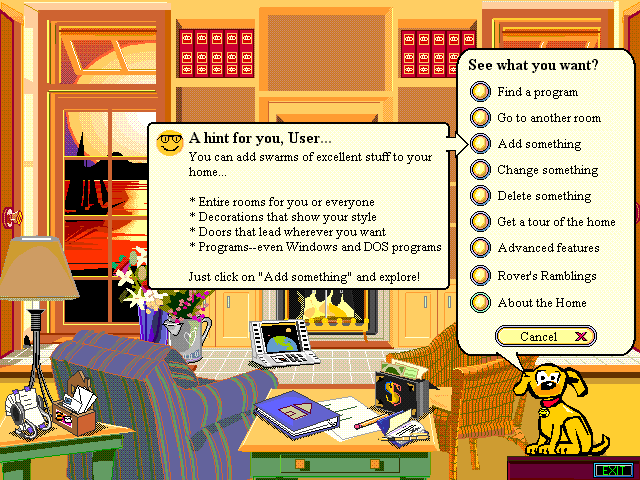
Flashback to March 1995: Madonna was on top of the charts, Ross finally got up the courage to try to woo Rachel and Microsoft released a user interface called Bob. It was an approach to make the computer interface less boring, tailored to less tech-savvy audiences. People who were new to this computer thing, kids or older users. As part of this mission, Microsoft heavily celebrated the “desk-top” metaphor, creating rooms complete with file cabinets, trash cans and a window you could look out. The user was guided by a little dog named Rover.
Bob had just one issue: as cute and quirky as it was, people didn’t like it. It was basically unusable, complicated and way to annoying to perform everyday tasks. And it certainly was no fun to use.
So how does fun work?
According to Raph Koster, author of “A Theory of Fun”, fun is mostly the result of a learning experience. When we learn and make progress, we experience joy, which keeps us learning until we master a skill – a key element of games. Games, so Koster, are basically “Edutainment”, teaching us life skills in a safe environment. When we play, we learn. When we succeed in learning, we have fun.
When designing fun experiences, there is 3 ingredients that cannot be missed:
Interaction & Feedback
Fun is about Feedback and Interactions. Interfaces that invite you to be touched and that react to this. Both in big and in small scale. Macrofeedback and microfeedback.
A great example for macrofeedback is the Material Design showcase: Big interface elements, the primary buttons and touchable elements clearly stand out. Every action gives you an instant feedback, every tap a subtle animation. Readable interface transitions tell you where each element comes from or goes to, upcoming views build up from the buttons that were clicked to call them. This explanatory feedback causes much less frustration when handled by a new user, but it’s also great to watch and experience – it is fun.
Same brand, different example: Google is using its intelligent mark both as a branding sign as well as an action indicator & loading spinner. This little interface element, designed by Thisalso reacts to user actions and input. Although this has almost no real estate on the screen, it gives instant and valuable feedback. It says: I am doing something, don’t worry. Just like the little connectivity spinner in the top right corner of your iPhone or slim red loading bar on the top screen of Youtube. Microfeedback can help to avoid frustration, which is essential when designing fun: The absense of frustration.
Curiosity & Surprise
Fun is about curiosity. We like to get surprised, we like a bit of the unexpected. This can be tiny detail, like the randomized messages on Slack’s loading screen, an unexpected “empty” state in a mail client or the little scissor on the top of Kickstarter’s footer section. If you’ve never seen this, go there now and click it. I’ll wait for you here.
Expecting the unexpected is part of the human nature, discovering and unveiling things and interfaces a great pleasure. This is why we like baseball cards (or Panini football stickers if you grew up in Europe), Kinder Surprise (if you grew up in Europe) or christmas calenders (well, Europe).
Microsoft Bob tried to convey this through different rooms and illustrative interface elements instead of squarish icons on a white background as in all other graphic operating systems at the time. A rolodex for contacts. A letter-box for electronic mail. A checkbook for banking. With those on the nose metaphors, there was little room left to suprise the user – and those elements not quite as fun as Microsoft.
Personality
Fun products will speak to you like human beings. They have edges, moods, flaws, they have a personality. Personal products have empathy for the user. They feel with you. Having a mascot as the face of your product can be a way of doing that, but does not guarantee you a personal product. Microsoft’s Rover sure is a really cute character, but if you look inside his speech bubble, you will only find a computer. Pure instructions and hints, no indication of Rover being a dog, no relations to you, the user. Rover does not have a personality.

It’s fucking raining now. The Authentic Weather app is a quite basic weather app. It cannot tell you wind speed, surfing conditions or give you an allergy report. It pretty much only tells you how the weather is right now. While it does so, it sounds like that grumpy uncle or a bit like me, looking out the window. It adds an emotional layer to the pure weather conditions, it adds personality.

Personality, feedback and surprise – the 3 key ingredients for fun experiences. But there’s one more: Designing fun is a lot of hard work. It’s a ton of iterations, tests and variants until you get it right. The trick is to make it look easy. This is how a product will feel like fun as well!
Thank you for reading! What is fun for you? Do you agree or disagree or want to add something? Please let me know on Twitter: @johannesippen. Looking forward to your comments!