Delightful Details
“Houston, Tranquility Base here. The Eagle has landed.”
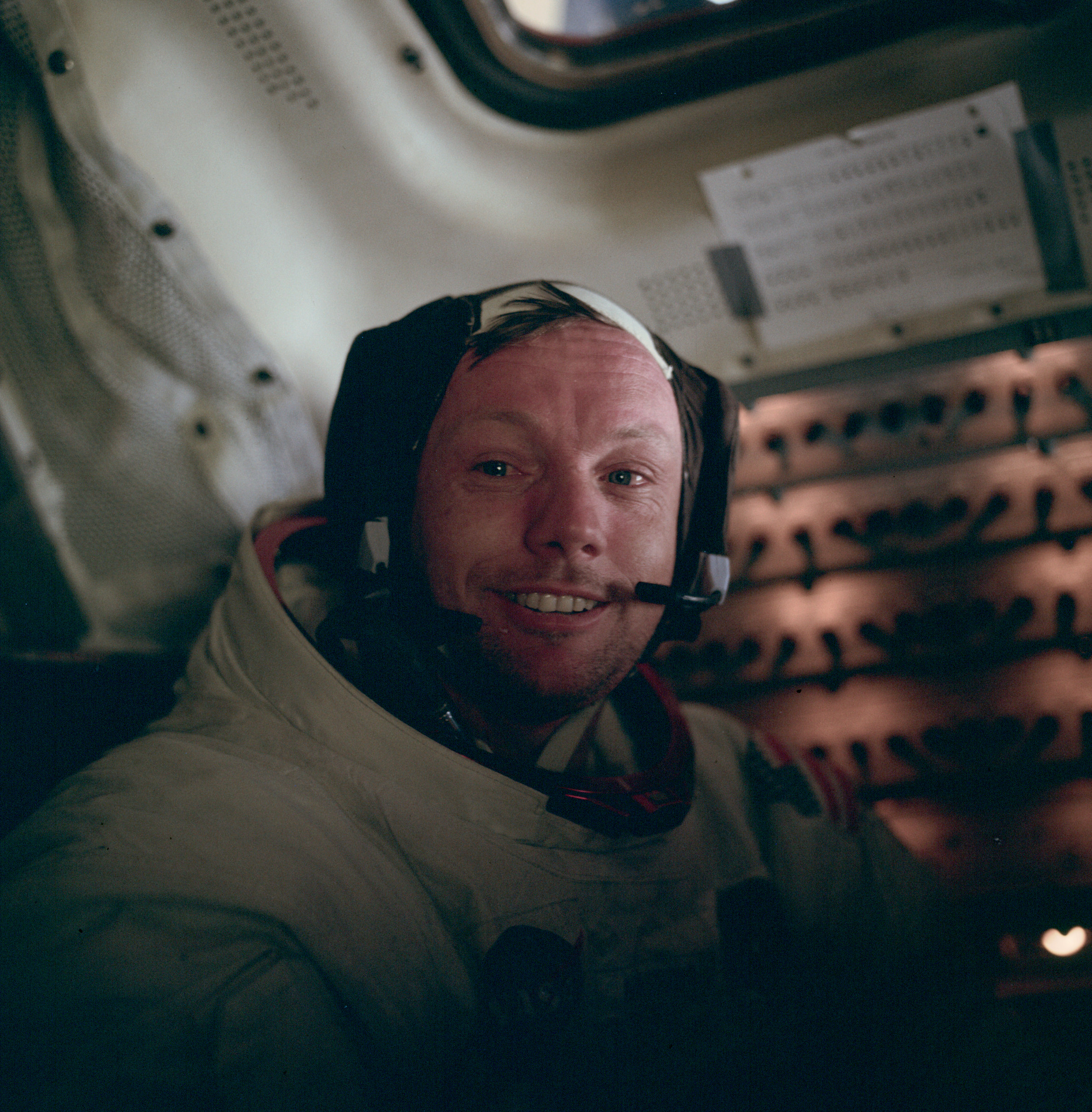
On July 20, 1969, shortly past 8 PM, the lunar module of Apollo 11 arrived safely on the surface of our moon. Eight years of research, design, development and endless tests. Over 75 hours of flight later, Neil Armstrong and Buzz Aldrin are ready to take the first steps on the moon.

Too excited to sleep but yet exhausted, the two men decide to take a walk on the moon now, not later. They do as they rehearsed so many times: Get in their space suits, attach the oxygen modules, put on the big helmets and depressurize the tiny capsule. That’s when it happens: While turning towards to exit vault, one of the men makes an unlucky move. Unheard in the vacuum of the airless pod, his heavy backpack breaks off a tiny switch on Eagle’s dashboard: The ascent engine circuit breaker.
“Mission Control verified that the switch was open, meaning that the engine was currently unarmed. If we could not get the engine armed, we could be stranded on the Moon.” – Buzz Aldrin
With an unthoughtful movement, the astronauts just ripped their ticket back to Earth. A tiny detail, unrecognized by engineers, project managers, and dashboard designers could turn the greatest achievement of the 20th century into a national tragedy. A tiny detail that is about to kill two men.
“God is in the detail” – Ludwig Mies van der Rohe
In digital product design, we often speak about MVPs. Minimum Viable Products. A version of a product that contains only the minimal feature set, unfinished, unpolished, undetailed. Yet the idea is clear: Get an idea of the finished product, take a glimpse into the future.
While MVPs are a great way to iterate on your product and to test the most basic feature set, they are missing a great opportunity: Details. We tend to think of details as polish, as the icing on the cake. But we tend to forget that details can completely change the way we see a product. Small details can have a great impact, they can delight users and turn a standard product into something special.
Speaking of switches: When the app Camera+ came out, they added some solid features to the original iPhone camera. Filters, exposure and so on. Yet the biggest feature was a tiny detail: A hack allowed the software to turn the iPhone’s hardware volume switch into a shutter button. Photographers and iPhone users loved that feature, Camera+ moved to the Top 3 in App Store over night.

Out of a sudden, the iPhone camera didn’t feel like a toy anymore, but like a real and usable camera. So much that Apple “borrowed” that feature for iOS5. Although they had previously banned Camera+ from the App Store for their creative use of the home button.
Today, using the volume switch as a trigger is a common UI detail throughout most smartphones. Tiny switch, big impact.
There are more examples:
Example One: Making more of the information
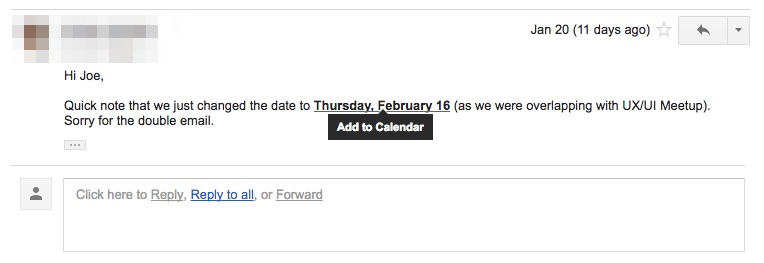
When you receive an email in Google Mail or Apple Mail with a phone number or a date, those will be highlighted to you. Apple underlines the detected date to makes it easy for you to add it to your calendar. Google Mail suggests you make an appointment in Google Calendar.

Using the information that is already there and doing one extra step that makes the user’s life easier doesn’t seem like a big thing. But it can have a great impact when applied to a product that used on a daily basis. AI assistants are using this technique to give people better feedback, but it starts with the simple things.
Like this: When you use the term “please find attached” in an email written in Google Mail, the web mailer will remind you to add an attachment before sending the email. Clever, isn’t it?
Example Two: See opportunities in unexpected places
When you switch to Editing Mode on the Medium platform, the Favicon will switch from a solid Medium Logo to a wireframe version of it. At first, this might seem a little gimmicky, but it can actually help power users to identify which browser tab they are using to write a new article.
Slack does something similar: In the web version, they use the Favicon to display if there is an important message for you. Finding those seemingly decorative elements and giving them a new meaning is what makes those features great and actually useful.
Example Three: Delight me!
When you start playing a song from the soundtrack of the 2015 Star Wars movie “The Force Awakens”, Spotify will change the progress bar to a light saber. How awesome is that?
Whether you like this feature or think it’s stupid, will say a lot about your personality. While it seems like something completely unnecessary and random at first place, it is the coolest thing to real Star Wars fans. Spotify acknowledges this and shows the users: “We share your passion!”
Details are an important element of UX Design. If you get the details right, you can change the face of the product. A detail can make the difference between a version of an existing product or a completely new standard. Details, more than ever, deserve our full attention. And there’s no reason why details cannot be part of the MVP: Being aware of the potential impact one can have, they can be evaluated early on.
Luckily, details in a digital product cannot kill people. What about Neil Armstrong and Buzz Aldrin? Almost killed by a detail, they were also saved by a detail:

When equipping the Apollo Shuttle, NASA decided to provide the astronauts with Duro Felt tip pens, a normal marker with a metal cap. This exact metal cap served Aldrin as a replacement switch: He engaged the engine with the cap of his pen.
Details can save lives. Or at least make our lives better. What kind of detail do you like? Any detail that changed the way you use a product? Let me know on Twitter: @johannesippen