Demystifying Editorial Design
Everybody seems to be talking about VR, Video and Gamification nowadays. Awesome new technlogies and experiences have entered the stage and our devices. Yet, the internet is 90% text. How do we get people to read?

Enter: Editorial Design. What has been a great craft in the times of lifestyle magazines seems to be almost lost and forgotten in web publications nowadays. Including this one. Technical limitations, responsive design considerations have made proper editorial design quite hard. The most important factors: Limited time and money.
When I studied communications design, we had a course in magazine design, led by a renowned editorial designer. We had to create our own little print magazine, including layouts, photos and text styles. The main feedback we got was: “This has to look more magaziny”.
Right after university I started my own digital mag, the Aside Magazine for the iPad. The main challenge was: How could I get what I learned in university about magazine design onto my iPad screen? How could I make it look “magaziny”?
Together with my buddy Nico, we struggled to do that for quite some time, until we realized: It’s not about that. It’s not about making stock photos and Lorem Ipsum-test look “magaziny”, it’s about solving a problem. Here is what I learned from creating a successful interactive magazine for the iPad. This is my Editorial Design process – in 5 simple steps:
Prologue: Start with the Problem
Design is about solving problems, and so is Editorial Design. The most common problem you will encounter when doing article or magazine design is how to make people read. You’ll have a big lenghty text, but how do you get people to read it?
This means you need to have real content. There is no Editorial Design with Lorem Ipsum, you need to have the right text – and the motivation to get people to read them. Before you start, read the text yourself. Then, go ahead with step 1.
1 Find and add Images
This might seem to obvious, but has a huge impact. Find pictures, photos, illustrations that match your text. If you have an interview, add a portrait photo of the portrayed person. If your text is about a place or a thing, find a photo from that place or thing. If your text is a fictional story, get an illustrator to draw you the key scene from that story.

Humans are visual creatures. If we see a visual representation of an abstract something, we are more willing to process that information and save in our longterm memory. Adding images helps people to digest and understand texts better.
2 Structure your content

It might seem obvious, part 2: Format your text, structure it in paragraphs, headlines, sections, side infos. This basic structure will give your reader a simpler way to approach the content. It will also help you to identify lengthy or overcrowded parts.
3 Simplify

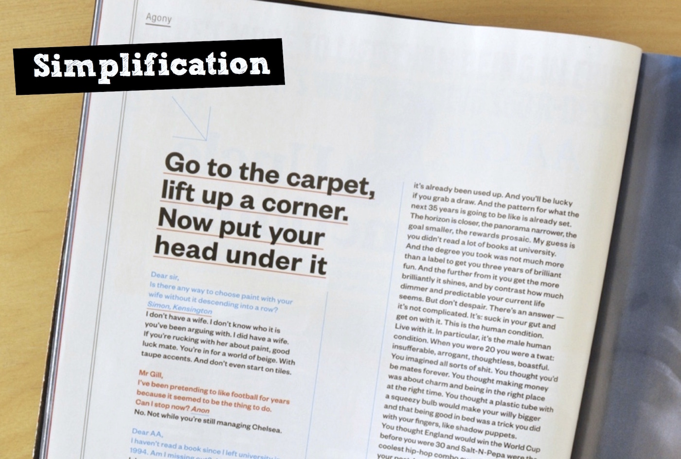
This is the tough part: Not all parts of a text are actually worth reading. Identifying useless and boring parts is one thing, removing them the logic consequence.
Simplification means to alter the actual content and structure of your text: Make headlines shorter and punchier. Add whitespace.
4 Visualize the Information

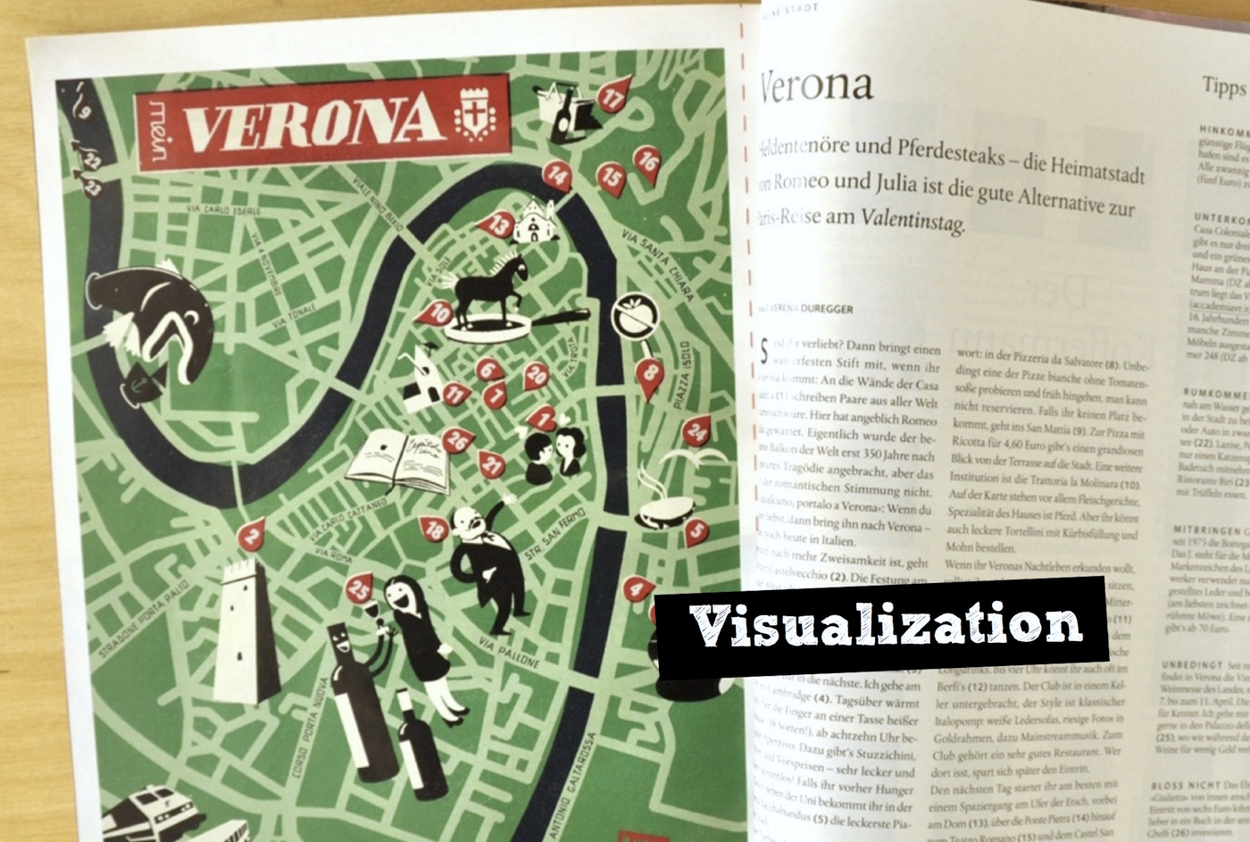
Sometimes, information is better off when not in textual form. Can you turn the facts into a graph or an infographic? Can a map replace descriptions of places in the text?
Instead of adding images or visual representations, this part will replace texts with their visual counterparts.
5 Emotion
When you have the basics right, take a look into the tonality of your text: What is the text about? What’s the mood and underlying tone? How can the layout reflect that? Is a certain choice of color or typeface helpful?

A text about the Bauhaus e.g. should be set in Futura, while a travel diary is set well in a handwritten font on a Moleskine-like ivory colored paper. A text about Che Guevara is best surrounded in a bold red layout, added stars.
Applying the tonality is what is usually perceived as the “beautification”, but it’s not. Beauty is much more the result of good design. Of design that gets the basics right. An attractive tonal layer makes it easier for the reader to understand what to expect from the text.
Epilogue: How to create award winning Editorial Design
Five simple steps. That is my approach for Editorial Design – when it’s so simple, why doesn’t everybody do it like that? What differentiates award winning design from good design?
People tend to confuse legibility with communication. Just because something is legible doesn’t mean it communicates the right thing. – David Carson
In 1994, design legend David Carson was asked to make the layout for a magazine article that featured an interview with Brian Ferry. While at it, Carson found that the interview was dull and boring, so he decided to set it in Zapf Dingsbats, a typeface that can be seen as one of the grandfathers of Emojis.
Carson added his own opinion to the content – and changed the readers perception of an interview that otherwise would have been forgotten today.
How do you design? What’s your approach? Would you rather share your progress or keep it to yourself? Let me know on Twitter: @johannesippen