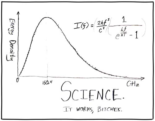
Science in Visual Design
When you’re a designer, it’s quite likely you went to Art School. As a studied designer, you probably hold a B.A. degree, a Bachelor of Arts. You’ll have people calling you a creative, an artist, or an artsy person. You’ve had people asking you to “beautify this”.
Have you ever been in this situation?
Design is not art. Design is not about beauty. As designers, we research, we use our analytical minds. We develop systems to solve problems. And even though these solutions might end up in something visual, there is more science in design than there is art. Good design is based on mathematical findings and behavioral psychology.
“I’m gonna have to science the shit out of this!” – Jason Bourne, Astronaut
In my work as a designer, I use scientific methods and tools every day. Here are some of my favorites:
Harmonies: Fibonacci numbers
Leonardo Bonacci, better known as “the most talented Western mathematician of the Middle Ages”, or short Fibonacci introduced Europe to a sequence of numbers in which each number is the sum of the two preceding ones:
1,1,2,3,5,8,13,21,34,55,89,144, …
The beauty of this sequence is that it’s an almost exact representation of the Golden Ratio – which is perceived to be the most harmonious ratio by most people.
This comes in handy if you need a harmonious relation between 2 elements, for example, if you’re creating font size hierarchies or element sizes. A button that is 55 pixels high and 89 pixels wide will appear surprisingly harmonious – science!
Information Architecture: Miller’s Number
The full title of George A. Millers publication is the perfect summary: “The Magical Number Seven, Plus or Minus Two: Some Limits on Our Capacity for Processing Information”. Miller states that the human brain has a short-term memory capacity of 7±2 information chunks.
Even though there are newer findings that state that the human brain can store much more information in an episodic buffer, the 7±2 theory is still a really good reminder to keep blocks of information compact.
Accessibility: Color Contrast calculation
Is that yellow text legible on this blue background? Should I use a darker tone of gray? While decisions often seem to be founded on taste and personal preference, there is an actually a cold hard science behind them.
It is contrast which makes the difference between blurry structures and well-recognizable elements. Contrast itself is nothing else than a difference in luminance and color between two objects, or an object and its background. This difference can be figured out mathematically. The WCAG defines a contrast ratio as the relative luminance of the lighter color in relation to the relative luminance of the darker color. A good and legible text should have a ratio of at least 4.5:1.
Time to get out your calculators, if you’re into that kind of things. For the rest of us, don’t worry: CSS wizard Lea Verou has created a tool to help us with getting the contrast ratio right – check it out on her Github: http://leaverou.github.io/contrast-ratio/
Usability: Fitts’ Law
“Can you make the button bigger?”. What seems like a whimsical client request has a psychological basis, known as Fitts’ Law.
What the law, coined in 1954 by psychologist Paul Fitts, predicts is that the time required to rapidly move to a target area is a function of the ratio between the distance to the target and the width of the target. Main take away for UI/UX design:
If you want the user to successfully hit a button, you need to make it bigger – or get it closer to the user’s finger. Basically, Fitts’ Law is the key essence of onscreen usability.
User Experience: Schedules of Reinforcement
Rewarding users for actions they take on a website or app is an important part of user experience design. The right amount and timing can be crucial to driving retention and engagement – but how to determine?
Psychologist B. F. Skinner used operant conditioning to reinforce behavior, defining the schedules of reinforcement:
Continuous reinforcement (CRF) means that every time the user does something that they’re supposed to, they will be rewarded. The downside: People get used to this kind of reward very quickly.
Interval schedules help to solve that problem: people will be rewarded at certain times, e.g. once a week. Skinner differentiated between fixed intervals (FI) and variable intervals (VI), the latter being a bit more random and harder to get behind. The advantage: you keep users aroused for much longer until they learn the reward-pattern.
Ratio Schedules are depending on the number of actions taken. Users will not be rewarded every single time, but every X times (fixed ratio, FR). With a variable ratio schedule (VR), reward patterns can be kept much more random.
Operant conditioning is often used in games or gamification, from Coffee Shop Stamp Cards (Fixed Ratio) to Daily Rewards (FI) to Slot Machines (VR). Planned in properly in your experience flow, they can prevent users from getting tired of your product, even more: get them hooked on it. Use them with care!

Which scientific methods do you use when it comes to designing, user research or building experiences? Let me know on Twitter: @johannesippen