«We want to see how we can use the old machines and bring them into the present» – Interview with Erik Spiekermann, Part II

Read part 1 of the interview here.
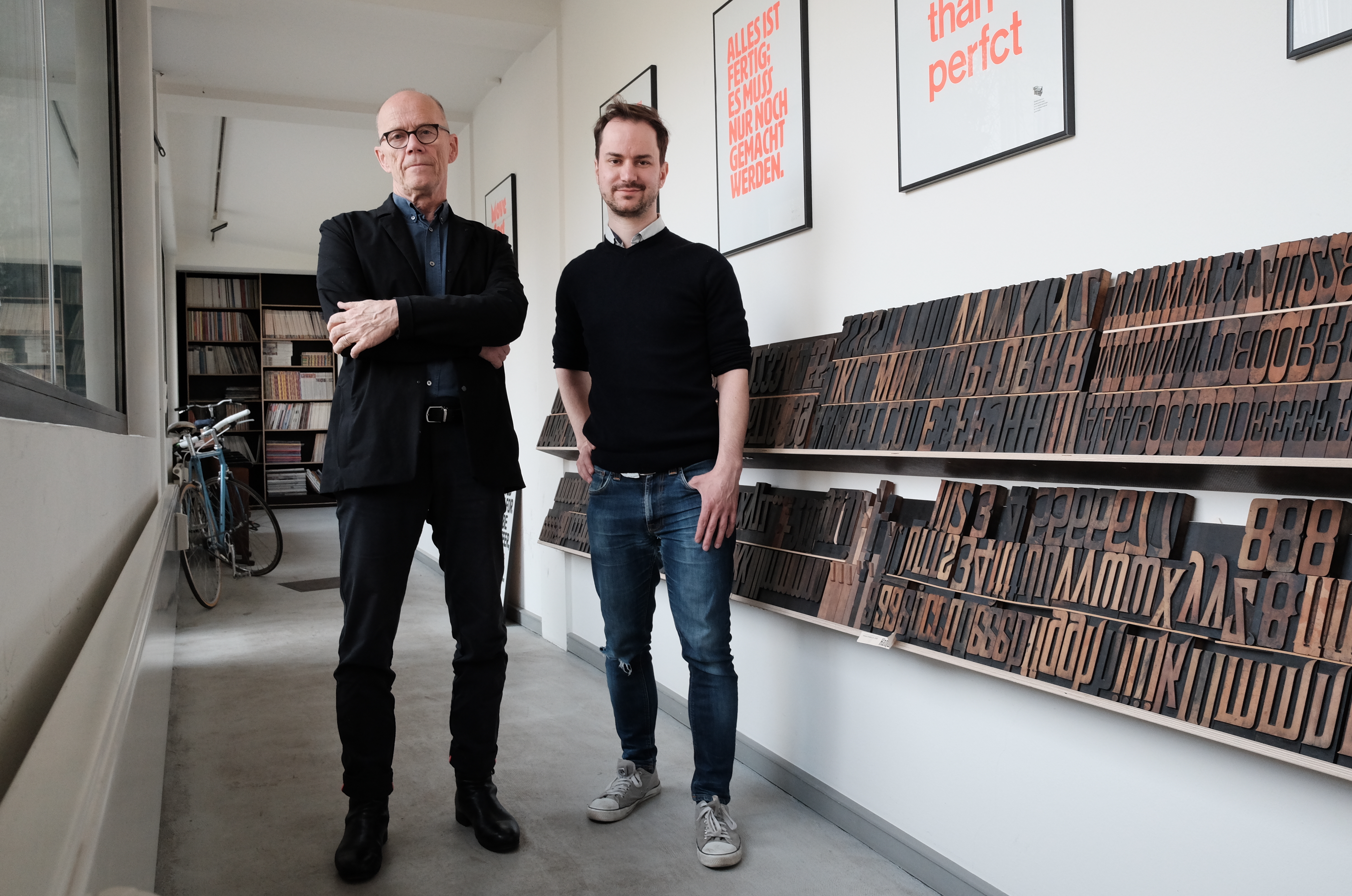
We are sitting in the kitchen of Erik’s studio p98a. In the background, a cleaning lady is tidying the place. Erik briefly spoke with her before and thanked her for her hard work. Yesterday, a big TV station came to film him at work with his letterpress machines. Later today, he has to finish a project for a big business newspaper. Always busy.
When I met Erik for the first time a few years ago in Barcelona, he would give me a hard time about the typeface on my business card. He had previously tweeted about my Aside Mag project, so I wanted to thank him for that. I walked up to him after his talk at OFFF, telling him how grateful I was for his support, handing him my business card. «What’s that terrible type on your card?»

I didn’t tell him this story and I would wonder if he remembered. Nevertheless, we talk about typefaces and the role they have had on the development of design in part 2 of our interview:
Today, we have way more tools then we used to have, and you have been a big part of delivering these tools. Before you started FontShop, designers had to stick with the typefaces the print shop had in stock. How do you see the situation today?
It has gone the other way: We have so many tools today that it feels good to be going back to something stupid like letterpress. Going back to a limited set of choices seems to make sense. If I design a book, which I do a lot, I could pick any font I like. That sure is refreshing, but it’s also refreshing to have the limitations up: If you come here and want to print something on the letterpress, you are limited to the letters that are available in one size – and there are only so many letters.
Do you embrace the limitations in your creative process?
It’s easier! If you go to a restaurant in Italy, you have 3 dishes today. There is no menu – the patrone comes to your table and asks you: “Pasta, fish or meat?”. If you go to a Chinese or Indian restaurant where you order by the number, and they have 600 numbers or more, it fucking kills you. I just want food!
600 million colors? I only know twelve of them. It’s great, but it’s also frightening. It’s great that we have the choices, but from time to time we need to breathe, we need the limitations, mostly for our own soul.
Like home-cooked meals: the ones that are limited and improvised are the ones best remembered, not the ones where you spent two days in the kitchen making them. That was me last night: I found half an avocado, two eggs, and some lemon and cottage cheese, which I turned into a nice avocado cream with poached eggs on top.
I never know how to poach eggs!
It’s terrible – one out of three works for me. But even with friends visiting: You will always find something you can make. I make sure there is always some pasta, a can of beans or tomato, zucchini or bell pepper.
Having a good set of standards help you to be creative, to improvise?
Yeah, it grounds you! If I am in front of my letterpress printer, having something to set, I know the paper size and the length of the sentence – so I have an idea of the font size and I am already limited in the number of choices. A great example is the poster for “Done is better than perfct” – this sentence would have five e’s. But I only had four e’s in the typeface, so now it’s “perfct”. It wasn’t witty, I was just lazy – yet everybody likes it.
You are officially retired – what are you working on right now?
We restored one of the big presses and printed “Krautreporter” on newspaper, which is incredibly large! It took half a year, and it was fun doing. We did a project with Adobe last year, where we took Bauhaus sketches turned them into proper typefaces. We will do something similar this summer. We do a lot of hand-cut display typefaces out of wood and metal. We’re also preparing a monograph on a type designer, Louis Oppenheim, printed from his original type.
We want to see how we can use the old machines and bring them into the present. There is no ideology here, we use whatever we have, you can print with cardboard or Lego, we even have a Risograph – printing and making something that wasn’t there before is the common denominator.
Editor’s note: A Risograph is a Japanese printer that can do one, max. 2 colors at once. The ink is held in huge cylinder cartridges, which can be switched out individually. Because they use real ink, Risograph prints have a very dense, saturated look – more like screen prints rather than digital prints. Obviously, we designers love Risographs.
If you weren’t a designer, what would you rather do?
I take a very keen interest in the development of cities and how cities work. How do we communicate, how do we get about? I’m interested in transportation, I might have gotten into town planning. I studied architecture history, that’s pretty close already.
Cities are an amazing construct – if I would have to start over, I would become involved in making cities work: Architecture, transportation, green planning, communication. Most of the world lives in cities already, and it’s getting worse. Cars are becoming really dangerous, and I love to look at alternatives for that. Why should I build a house for myself? Why don’t I get together with friends in a coop and share things like washing machines? All these questions really interest me – and I’m even thinking about going back into politics for that reason. I don’t know if there is a job title for that.
City planner?
Well, that is too theoretic, too bureaucratic. Somewhere in between designing and planning cities maybe. That is the great thing about being a designer as well: If you work with a client for a while, you have to learn a little bit about what they make. I’ve worked with public transport, electronics, car companies, printing companies. The bits of knowledge make us good generalists. I understand enough about architecture, construction, traffic, wayfinding. I think I could contribute to the discussion.
Thank you, Erik!