«Make sure you have a good idea that can survive, even badly designed» – Interview with Erik Spiekermann, Part I
Are designers really that important? What does it take to be a designer? A good idea is always to ask someone who has a lot of experience, who has been working in design for a long time. I wanted to know from the best designer I know: Erik Spiekermann.

Photo credit: Norman Posselt
Erik Spiekermann is based in San Francisco and Berlin, he has founded successful design companies like MetaDesign, FontShop and Edenspiekermann, to name just a few. He has not only taught ze Germans what a design system is but created also dozens, if not hundreds of popular typefaces, used by Deutsche Bahn, Bosch or Firefox. I have worked with Erik’s types since the beginning of my career: ITC Officina as a working student for the University of Applied Sciences in Berlin, later FF Axel for my diploma thesis and just recently his HWT Artz for a gaming brand.
I am visiting Erik in his p98a studio in Kreuzberg, where he has the biggest collection of working letterpress printing machines north of the Alps: “I want to die as the person with the most letterpresses”, he jokingly says. With 72 years, Erik is officially retired, which does not keep him from still showing up at work every day.
Erik, You’ve just come back from San Francisco – would you recommend this jet-set lifestyle to anyone?
No. It’s not a jet-set lifestyle by the way. My wife has a house there, I go there once or twice a year for eight or ten weeks. I wouldn’t call it jet-set. Last year we had a workshop in Los Angeles for Adobe MAX, we might do the same again – I do get around, but America is mostly because of private connection. Tomorrow I’m jet-setting to Düsseldorf though (laughs).
Do you have a favorite place?
At home!
Where is home?
Wherever – the house in San Francisco is by the lagoon, it is more like a holiday thing. I don’t have to leave the house, I do conceptual work there. No disturbances, nobody comes to see me there, like today, where I have a visitor every hour. In Berlin it is more the real work, in San Francisco, I do more of the long term thinking.
Do you enjoy traveling?
I hate it. The more I travel, the more I hate it. I like riding the bicycle, I don’t mind driving long distances, but traveling on a plane, I hate it. I was in Brussels last week, even that was meh. It’s an hour-long flight, but it takes away four or five hours of your life. It’s never enjoyable.
A lot of your work has been centered around travel – when you’re on the road, do you see a lot of work? How does that feel?
It’s nice! Last year I was in Austria and they introduced a typeface I designed - with the help of Ralph de Carrois - way back for the European road network. It’s now on the signs all over Austria – if you go out of Vienna to Bratislava, you see my typeface, which is pretty cool. They must have changed all the signs in Austria overnight, it seems.

Photo credit: Ralf Herrmann
The same for Berlin public transport. If I take the tram or bus, I see our typeface FF Transit. It’s about time we overdid the information system, after 30 years, it needs a refresh!
In Düsseldorf though, where we designed the airport signage in 1996, they have redone it and I think that made it much worse. We had a special typeface, special colors. Now it’s really boring. It’s never just me, it’s always a team, but I think we gave them a better brand, had better signage. Now it doesn’t have a sense of place – you don’t know if you’re in Düsseldorf, Gelsenkirchen, Hamburg or any city in Germany. Before it was a lot more specific, it was better.
Are you ever fed upon seeing your work or recognize details that you don’t like anymore?
The thing about the Austrian road network typeface: I don’t like that typeface very much. We did the bitmaps first and then we drew over them, so it’s not very sexy. Then I made two mistakes: We had to do a condensed version – that is normal, German has a lot of long words, but then they persuaded me to do a compressed version, condensed-condensed. The narrower a typeface gets, the less legible it becomes. We do also know that we have long words in Austria, like “Gumpersdorfer Straße” in Vienna – so now they only use the compressed version, even for short words, because it’s easier for them. Then I get blamed because it’s not legible, but that is not my fault.
Maybe it is because I should have said no. When you’re supposed to work for a bad company, like weapons or tobacco, the argument is: “If I don’t do it, somebody else will, so I might as well do it.” If I wouldn’t have done the compressed version, somebody else would have done it, maybe even worse.
That is the crux of making the tools: You don’t know what people make with them.
That is it: It’s out there, by definition it is public. What other designers do with it, that is the risk we live with. Even with Berlin public transport: We design the system, but we don’t implement it. Certainly not in detail. Even a good system can be badly implemented, or a bad system can be well implemented. Especially with typefaces: I had bad typefaces look really good, and I’ve had good typefaces look really bad.
You said you’d wanna redo the Berlin public transport one – what would you change?
It’s grown so much. There are more lines than after reunification. There are new buses and trams that hardly existed before. There are new services and a new quality in service as well. It’s way more complex today. Berlin was two smallish cities back then, today it is one large city. Our main thought was to get it going. There was nothing when we started, so it was quickly done.

Photo source: https://www.pinterest.com/pin/427701295843446760/
The system still works, but it would be good to have an audit – going around, saying what works and what doesn’t. The client does realize it, but they haven’t bothered doing anything about it.
Wayfinding has changed – everybody looks at their phones nowadays. Signs play a different, a secondary role. The stations have been redesigned, repainted and relit – some of the issues don’t exist anymore, signs don’t need to be backlit anymore. That is good because you don’t wanna look at a lamp.
The color still works, the type still works, the arrangement still works. A lot of the hierarchies don’t work anymore. They improvise, but you can’t improvise after 25 years – it starts falling apart.
Speaking of change – what has changed for design as a discipline? A lot of your work is around the perception of design. What has changed?
There are two big changes: The first one is in the 70s and 80s when it was still called “corporate identity”, which has now become branding. The thing to impress clients was that all their communication was under one visual idea, one conceptual idea, one message: What does Audi stand for, what does Deutsche Bahn stand for?
Taking this idea and expressing into all levels of communication was easy when we printed stuff: We had guidelines, and even the early days of online stuff made it easy to follow these guidelines.
Now that it’s all branding and you as a designer can’t decide who sees what where – it might be on the phone, it might be on a poster, I don’t know. That’s the most difficult part.
The second thing is that now clients have a much bigger awareness of how important the brand is. We don’t have to sell the brand to a CEO anymore, they know that they need a strong brand. 25 years ago, we would tell them: “Look at all the details, the details are important.” Now we tell them the exact opposite, we don’t have an influence on the details anymore. Make sure you have a really good idea that can survive, even badly designed. It is a lot more ambivalent today.
Is focus on detail, is craft less important today?
It’s still what we have. The talent that the McKinseys or Boston Consultings don’t have, they can’t visualize anything. They give you 100 pages of whitepaper which takes you a day to read and you don’t understand half of it. We can simulate what things look like with a few sketches.
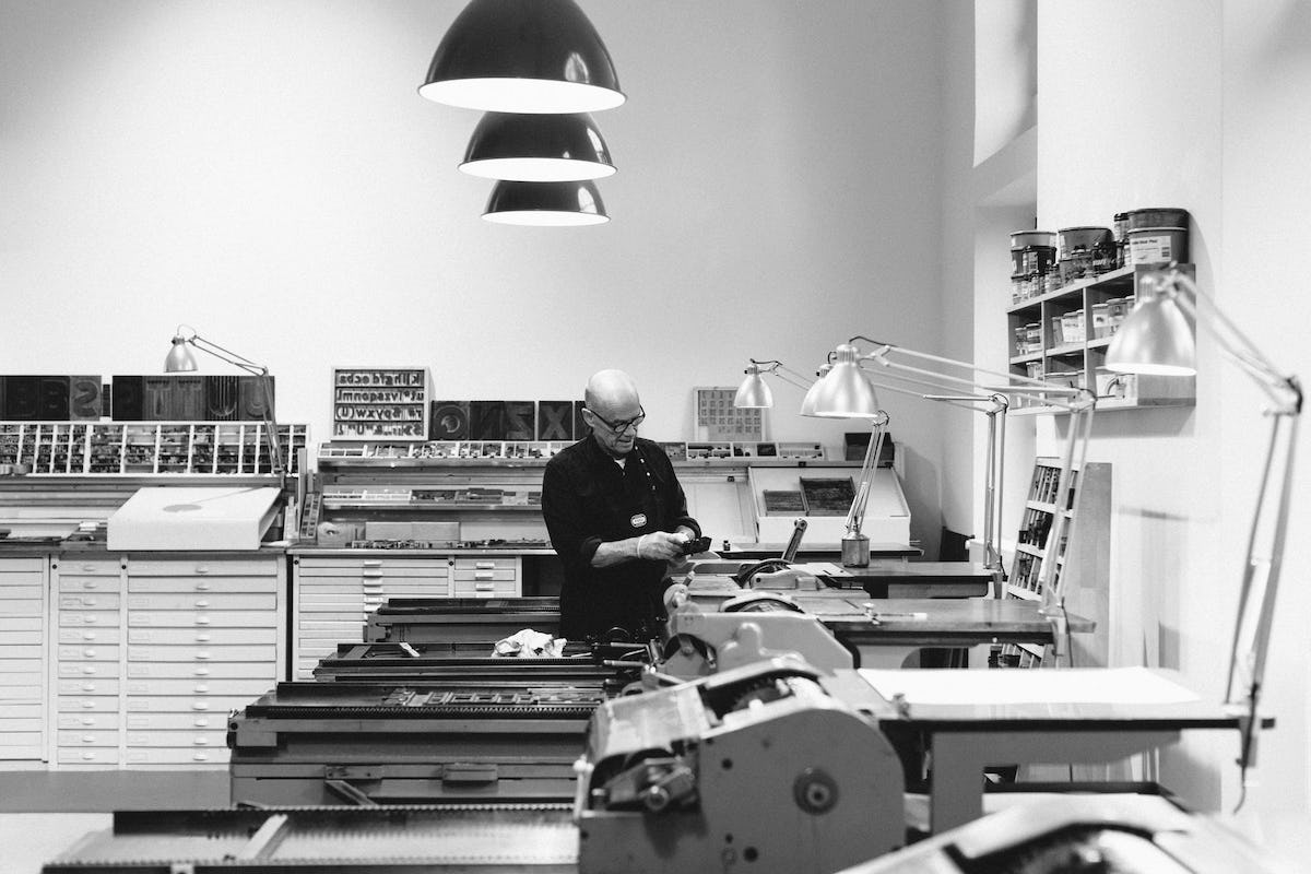
Photo source: https://www.p98a.com/workshops
You can’t buy a pair of shoes on the phone, you’ll have to try them on – that is the great thing we have, we can prototype very fast and cheaply. It helps to persuade people.
Take the Berlin Public Transport project for example: When we started, they said: “Our signage is good – when we lock our stations at 2 AM, there is no one left over, they all find their way home.” Convincing them to do new things was hard, like designing the train line diagrams inside the trains. The initial reaction was: “We have no space for it, we can’t fit it in” So we took a day making one for the U1 in 1:1 size – for the presentation, we held it up in the train, and all the Naysayer changed their opinion – and they all became my best friends.
“Shit, Spiekermann, you are right – you make us look better!” – that was my big lesson here: You make them look better, that is your job. We have the skill of showing them, not just complaining about things that don’t work. My Dutch friend Lucas de Groot put it nicely when he was learning German: “We have to verglücklichen our clients”, we have to make them happy.
That nails it.
Same with design prices: We once won the Slovenian Design Price for Bosch, which is not too famous – but it shows the client that your work is valued somewhere. Put your clients into a position where they are proud of us – that will make them loyal.
When clients change jobs or change companies, they will call you again and again. I had people who changed from Adobe to Autodesk and called me years later: “Working with Spiekermann was fun, let’s do this again”.
It’s all about human relationships.
That’s all it is about! You sell yourself. You don’t sell green or blue. My filter is: If my client would go out for a beer with me tonight after work, they won’t kill me.
That seems like a very low bar …
I’ve met enough people who I was afraid of going out with – and vice versa. They wouldn’t go out for a beer with me if they didn’t trust me.
In part 2 of this interview, we will talk about limitations, standards and poaching eggs. Don’t miss out on when part 2 comes out, get notified on Twitter or Linkedin!