
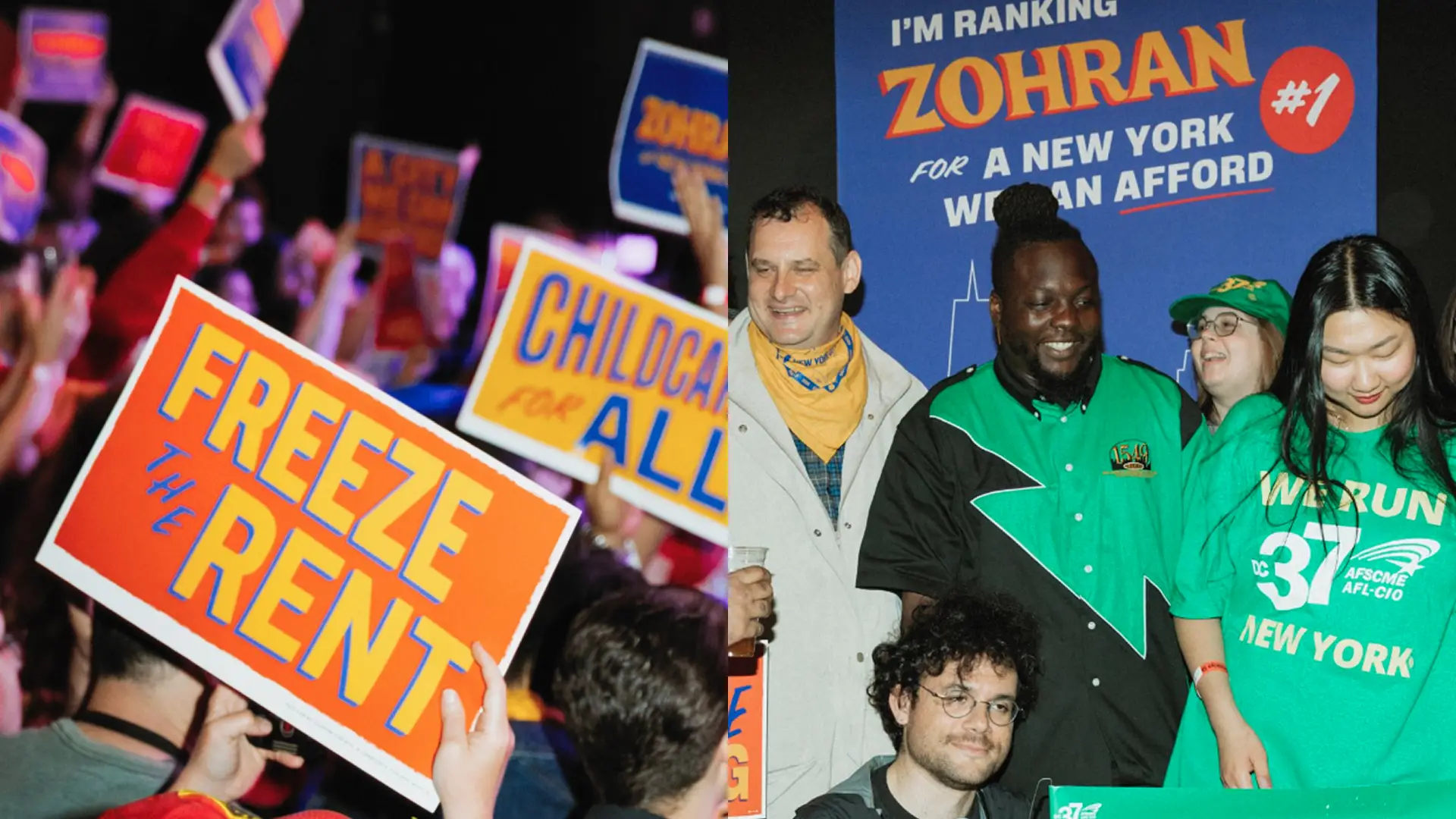
Zohran Mamdani won. He’s the first democratic-socialist mayor of NYC, the capitalist mekka. The first Muslim mayor of a city with strong Jewish culture. What seemed inprobable a few years back is now reality – thanks to a strong campaign.
Zohrans landslide victory comes at a time where many Americans have lost trust in the loyality of institutions. Yet the Zohran campaign managed to stay present, consistent and convince many (especially young) voters to elect the progressive candidate. What makes Zohrans campaign design, his brand, so special?
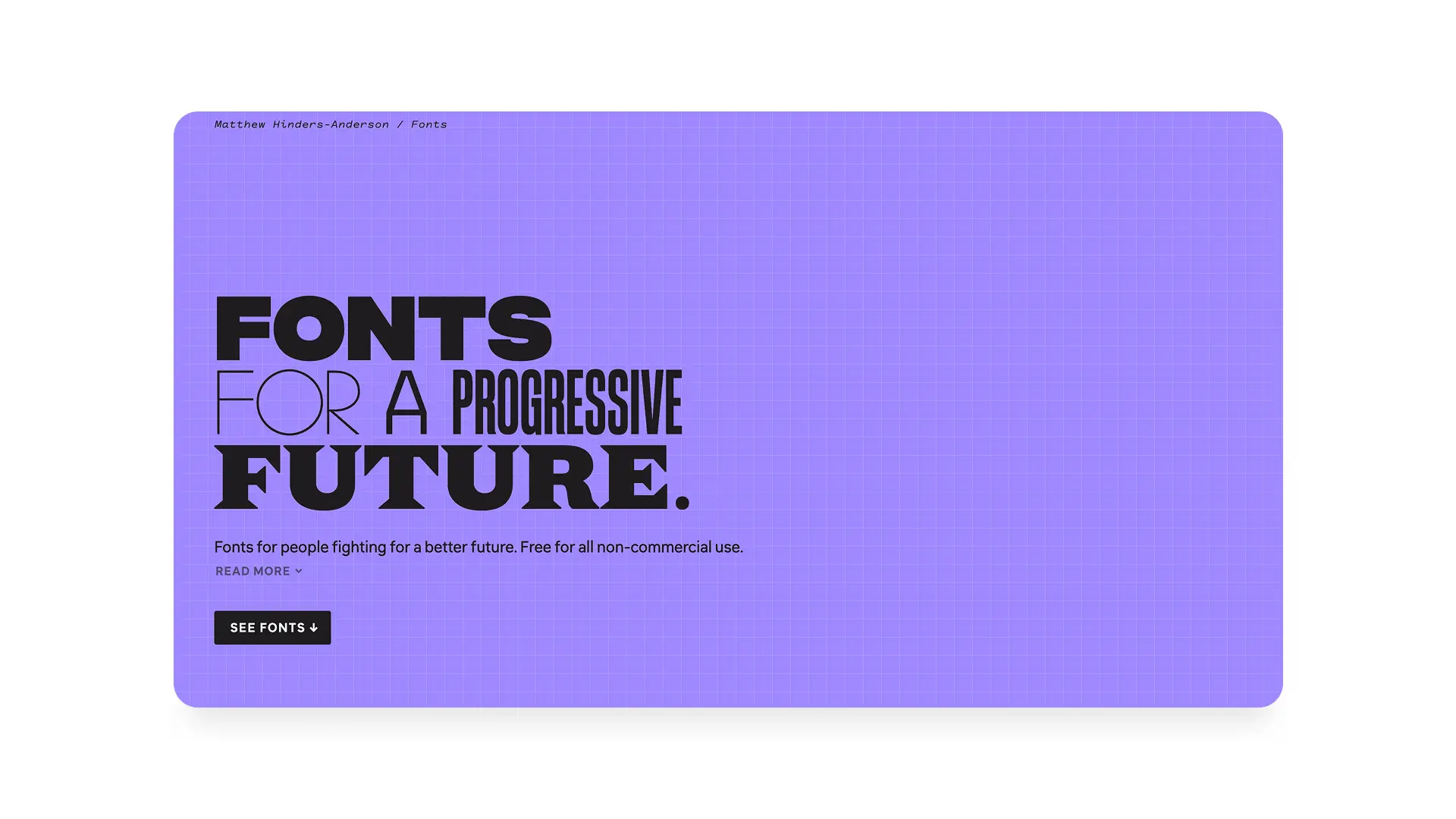
The brand design for the Zohran campaign was created by Forge Design Inc., a design cooperative made up of designer Aneesh Bhoopathy and developer Phil Ditzler. The team is using the free typefaces by Matthew Hinders-Anderson and is supported by photographer Kara McCurdy.
In true democratic-socialist manner, the design studio ascribes to the seven cooperative principles, which includes autonomy and independence as well as a concern for community. Good stuff.
The campaign caters to younger audiences – a huge chunk of Zohran voters are made up of a younger demographic, entry-level young profressionals and students who have been struggeling with the high cost of living in NYC in recent years.
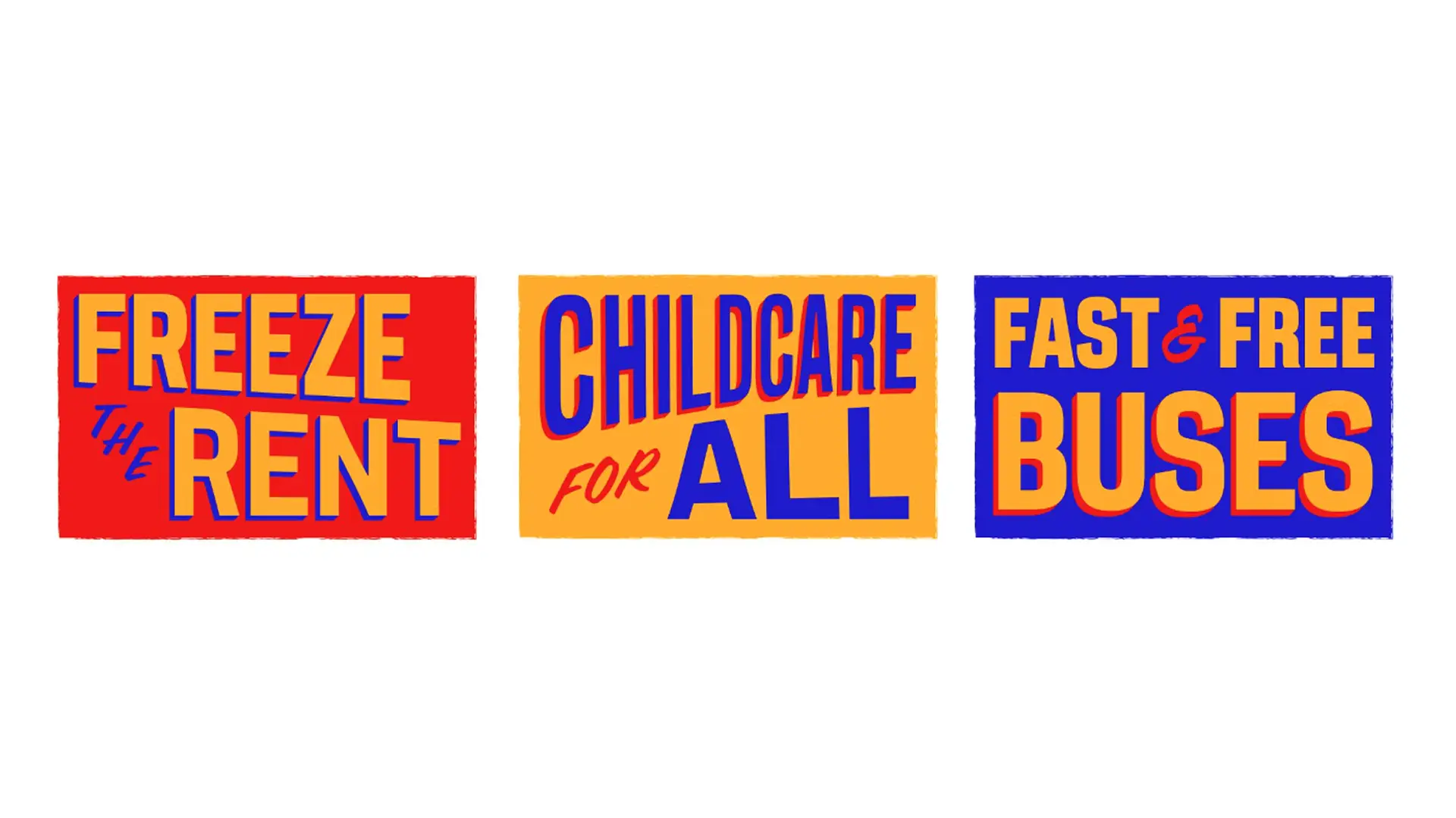
It does, however, take strong inspiration from a classic hand-painted sign aesthetic, as you can find in a lot of well-established and loved city institutions: Bodegas, food carts and delis. Admittedly, most of the younger voters might not remember a time when these were around, but the vibe of «good old affordable city dwelling times» is definitely strong in them.
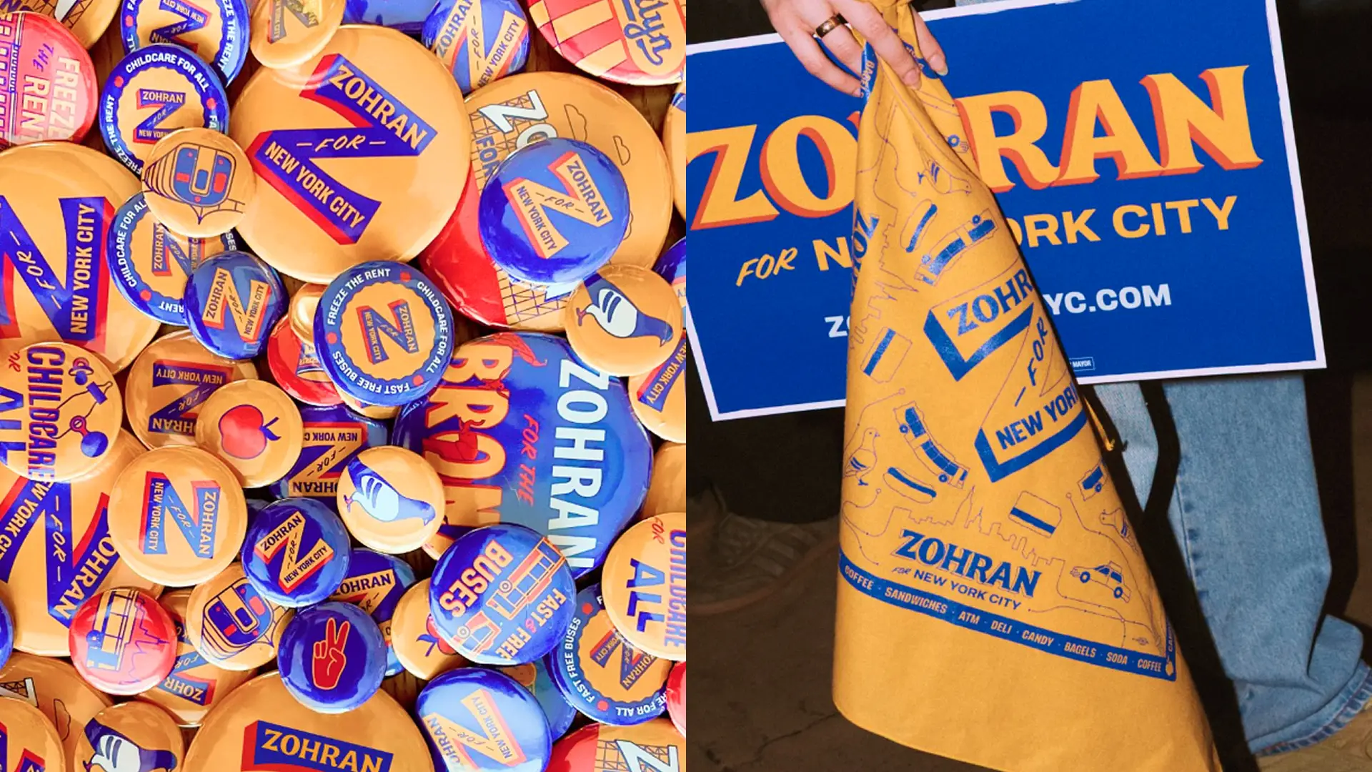
More important though: They are simple and adaptable – an important trait for a design that needs to be used, altered and modified by many initiatives, working on the same cause. Bright, primary colors and free to use typefaces are a great starting point to create your own version of the campaign message. Because of these simple characteristics, the campaign designs will always feel unique, energetic and on-brand when being adapted or handed down to street teams.
My favorite part about the campaign: It dares to stand out from the red, white and blue seas of US election campaigns. Even the most progressive posters and logos by the best and most innovate designers have always defaulted to the color palette of the star-spangled banner: From Shepard Faireys «Hope»-motif for Obama in 2008 to Hilarys H-logo, created by design legend Michael Beirut, which Quartz called «actually perfect» back in 2022. Red, white and blue – all of them.
With the introduction of a bright warm yellow, Forge managed to stand out from the political competition, while still tapping in to the cosy retro feel of the city.
What can you take away as a designer?
Infuse your design with your values. From the choice of your design agency to the origins of your campaign aesthetics – if your campaign lives and breathes your beliefs and ideals, it will become: authentic.
Design for adaptability. Simple, sturdy styles, easy to use colors and a minimal brand rule book will help your campaign to be used and extended by many. Be open and transparent about the rules that you define for your design. Make templates and examples accessible, use fonts that can be used freely. In fact, you can use Matthews fonts for free for your own non-commercial purposes: https://wehtt.am/fonts/
Stand out. If your goal is change, be bold and different than what we’re used to. A campaign visual, as much as the campaigns message, is a promise for the future.
Use it.