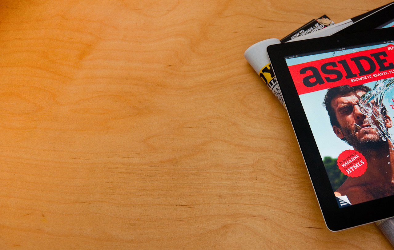

The first full interactive magazine for the iPad made entirely with web standards.
The rise of the iPad in 2010 started the era of interactive magazines. Every paper-publication started their own take on the tablet reading experience and brought them to the App Store.
With the Aside Magazine, I wanted to go a step further: Could I create a magazine-like experience with web technologies for the iPad? The motivation was simple: Being truely independent from Apple’s content guidelines, enabling future publications to have the same look and feel without the risk of being locked out of the App Store. Also, I wanted to showcase the new design features of HTML5 and CSS3.
I teamed up with Nico at Thanksalot and together, we developed a concept for a simple magazine with a handful of articles, infographics and interactive content. We put together a schedule, planning to launch the magazine after 6 weeks.
Ten month later, we finally released the Aside Magazine - way over schedule. What sounds like an unfortunate delay turned out to be the perfect timing. A new version of iOS allowed us to use more than one webfont in the magazine without crashing. The newly released iPad 2 gave our transitions and animation a much better performance, making the experience from “Well, that’s alright” to “Wow!”.
But also the mindset had changed: HTML5 became more popular, the awareness for open standards vs. closed infrastructures was at its peak. Shortly after we released the Aside Magazine, both Financial Times and Playboy announced their own WebApp versions.
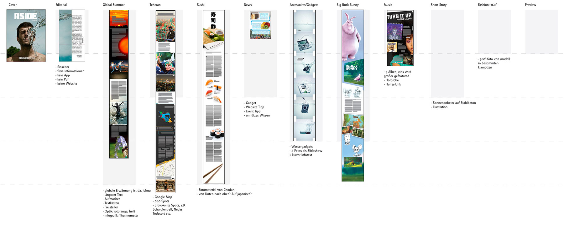
The biggest challenge was to create a magazine with web technologies without turning it into a website. We used classic print tools like InDesign to create the first layouts and prototypes, developing a typographic system first and adding interactive elements later. Every page would be printed out, looked at on paper and iterated over and over again. Our ambitious goal was to maintain a design that worked in both portrait and landscape orientation – an effort that readers wouldn’t actively recognize, but find very pleasing while using.
To achieve that, we developed a simple grid system that derived directly from print layout and would be tailored for the iPad using Responsive Design principles. The MagazineGrid is available under Creative Commons License for download.
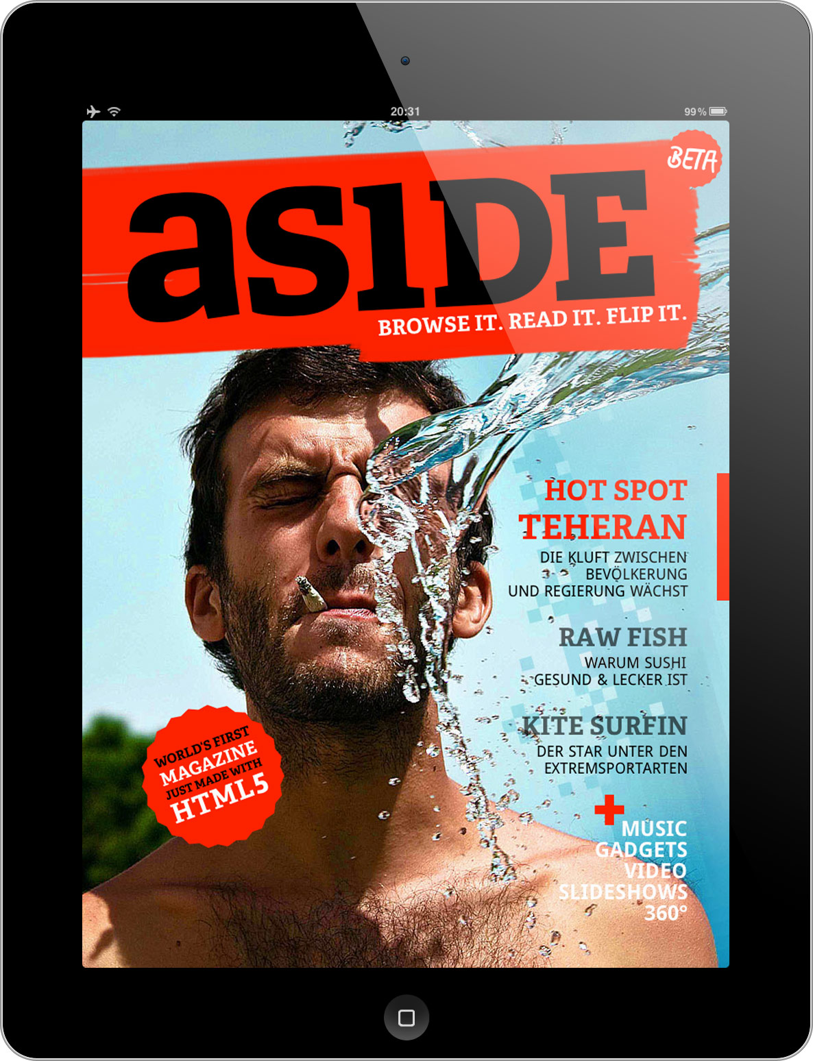
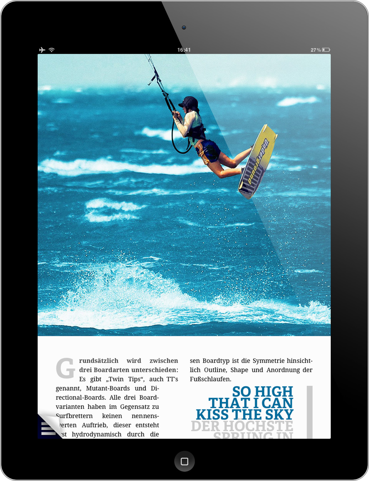
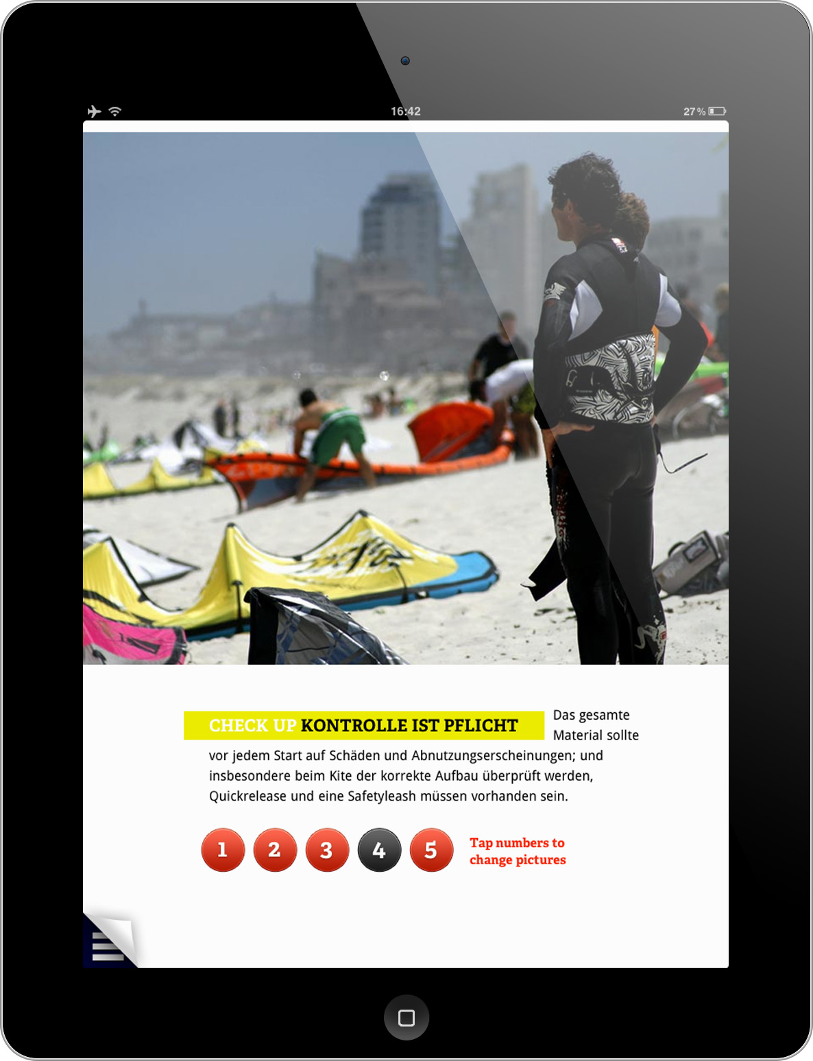
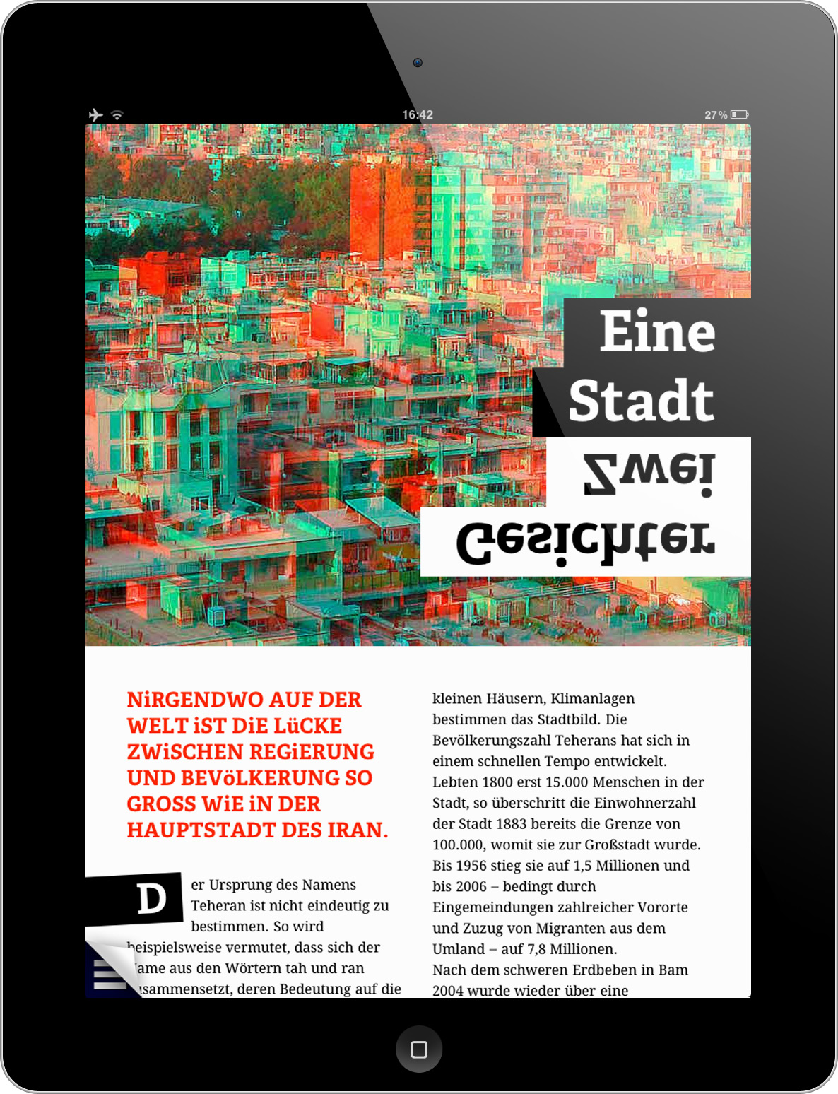
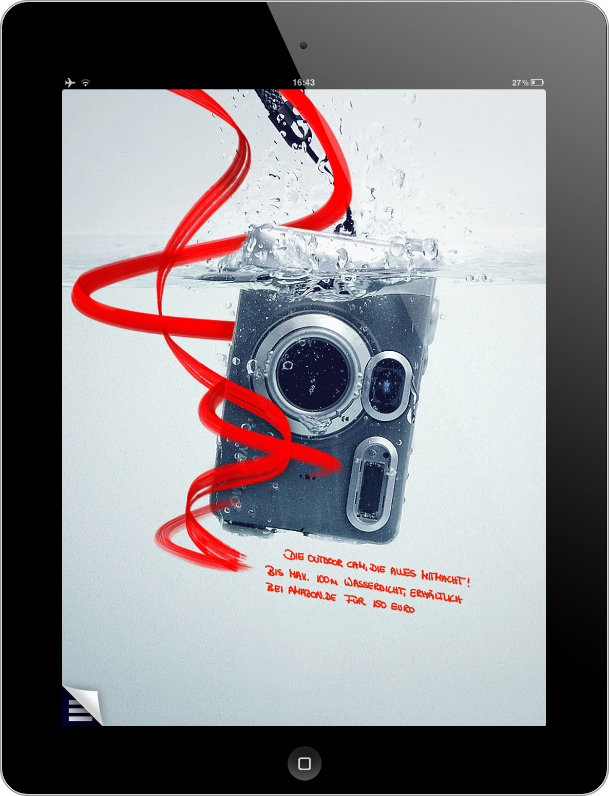
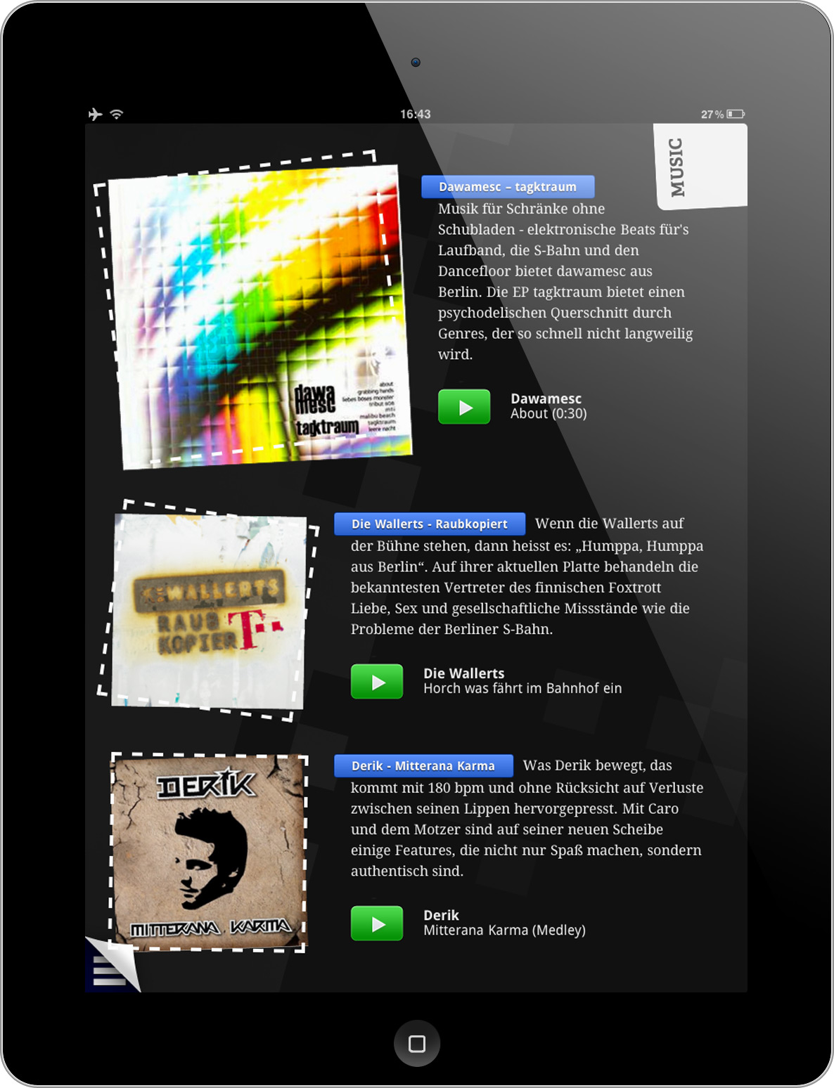
The actual goal of the Aside Magazine was to showcase the features that were possible with web technologies. The magzine is full of animations, transitions, slideshows, video and audio content, interactive infographics and rotatable 360° models.
Besides being featured on Business Insider, Wall Street Journal, Newspapers in Germany and Brazil, German television and design magazines like PAGE, the Aside Magazine attracted a huge audience. It was installed over 55.000 times in the first 6 weeks – that’s more than the iPad issues of GQ, Vanity Fair & Men’s Health at that time together. This is especially remarkable since the actual magazine content is in German language – people just loved the experience, although they couldn’t fully understand the articles.
readers worldwide
speak German
downloaded the free MagazineGrid
installs in the first 6 weeks.
countries - none of them from North Korea, Greenland, Nicaragua, Cuba, Madagaskar, Somalia or Albania
people emailed us