
A location-based social network concept – before Foursquare & co.
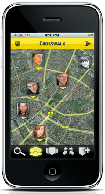
Crosswalk is my diploma thesis. In late 2008, I decided to combine the power of location-based services and social networking to create an app where I could see where my friends are and what they are up to. Foursquare did not exist yet, Facebook was just getting started in Europe. The idea as such was basically non-existent - perfect for a design student's final thesis.
I looked into current web trends and tried to figure out how a really innovative network could look like. At this time, Facebook, MySpace & co where mostly static websites with profile pages and really slow news feeds. If you break it down, all of our social web activity happened in long text lists. A post here, an information there – even chat messages where basically just a list of statements in chronological order. With Crosswalk, I wanted to change that.
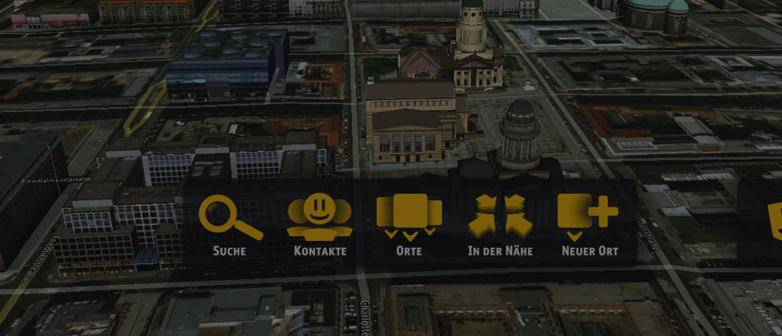
Crosswalk has two key ingredients: an interface that happens completely on a map and a really strong & simple privacy level integration.
I chose a (at this time super-new) three dimensional Google Earth map. Users would appear as little avatars directly on the map and always use the map in background as basis for their interaction.
All actions would fall into five categories: for yourself, lovers, friends, acquantaices and the rest of the world. A simple slider-button gave you full control of everything you posted.

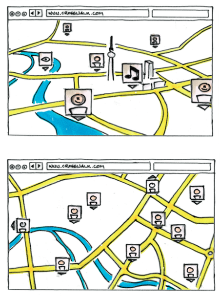
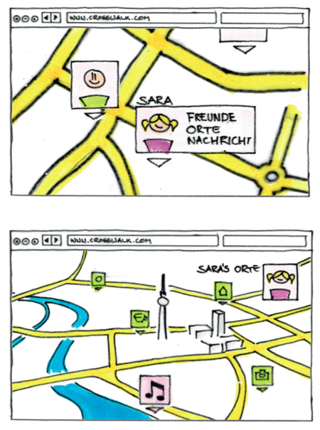
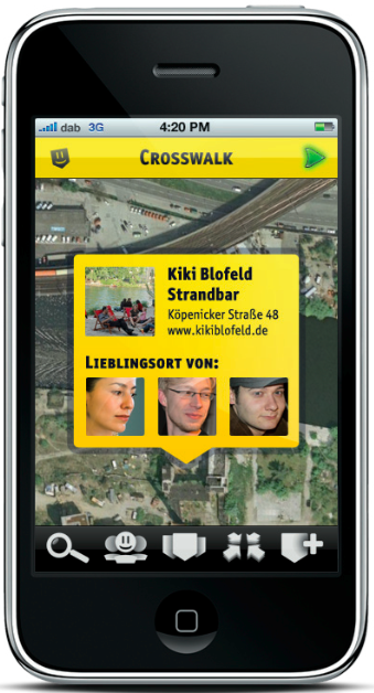
Everything in Crosswalk happens on the map. Searching for a friend? The maps moves to their location. See all friends? Your map would zoom out to city-level to show them all in one viewport. Having a conversation? The map would zoom & rotate in a way that both avatars are visible. The location context would always be present, encouraging people to use the geo features in their Crosswalk network.
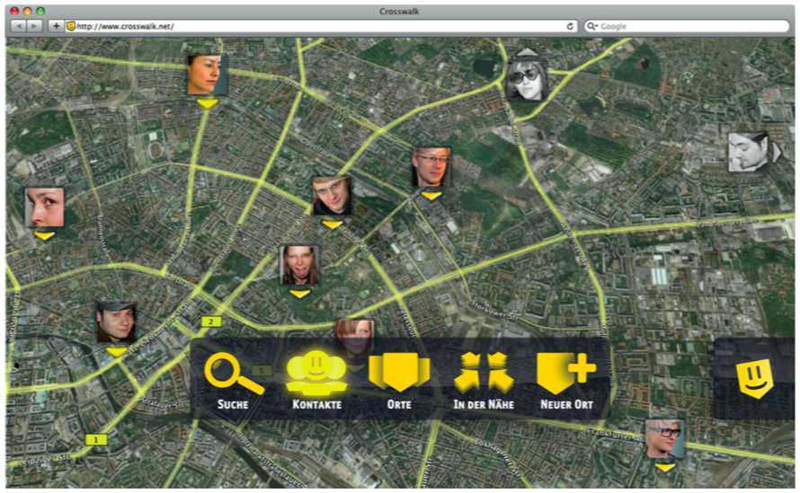
Connecting with people happens via drag and drop – pulling an avatar onto a location would generate an invite. The main UI element, a 5 icon toolbar would be hidden by default and only triggered when needed.
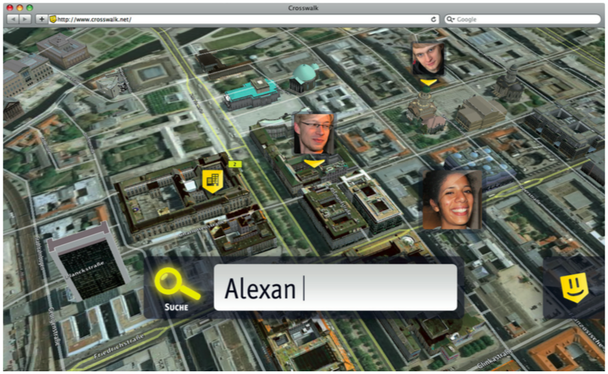
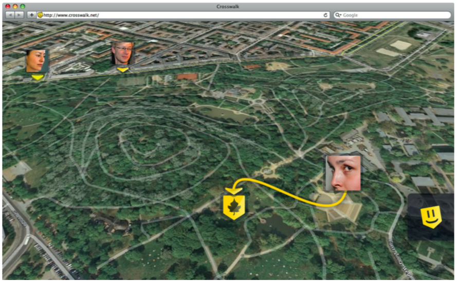
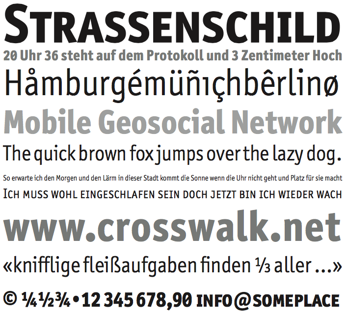
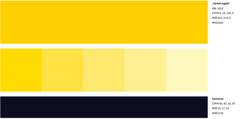
The inspiration for the name Crosswalk came from a huge crossing in Shibuya, Tokyo, where each time the lights turned green hundreds of people would meet for a couple of seconds. The yellow color scheme stands out of the quite noisey but realistic 3D maps. The screen-optimized typeface Axel by Erik Spiekermann was chosen to make the most of the screen real estate.

Crosswalk is an interface study and proof of concept. It was released in early 2009, just a couple of weeks before the first Foursquare version went live. While some of its elements look a bit dated (glossy overlays, OMG), others can be found in popular services today (Spotlight Search, simple privacy features).
