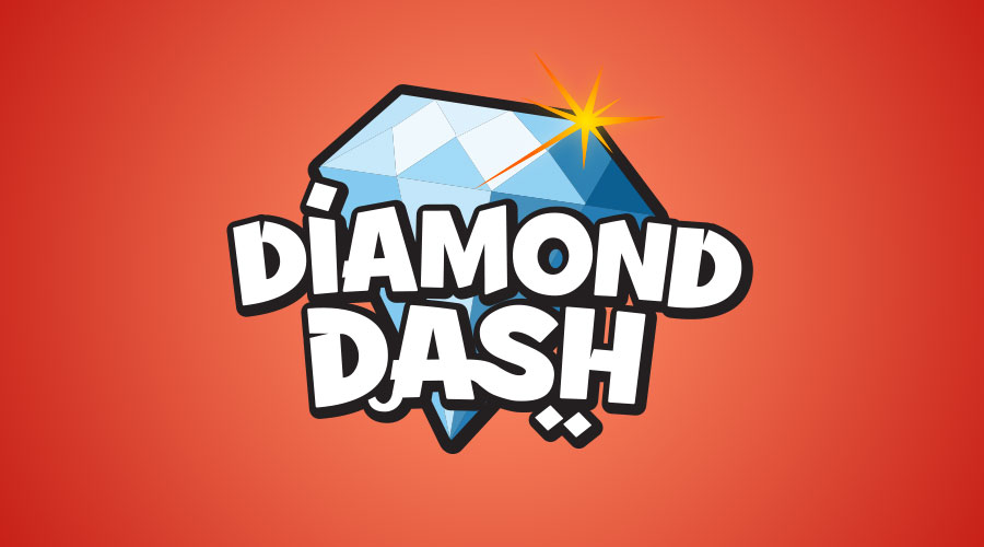
Played by over 200 million people worldwide, Diamond Dash is one of the most popular casual games ever made. As a designer at Wooga, I was involved creating artwork, icons, banners, videos, merchandising, microsites and more for the cute little panda.
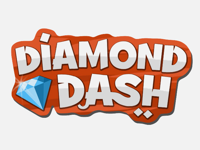
My favourite part though was the process of creating the Diamond Dash logo. After a simple briefing (“cute panda meets 1001 nights”) I tried several colorful variants, inspired by the shinyness of the ruby-like gems. However, none of these really worked.
These colorful variants did not work for 2 reasons: The logo drafts were way to detailed for the environment it had to stand out in. Diamond Dash started in 2011 on the Facebook platform, most of the user acquisition took place via the Newsfeed or wall posts. The second reasons: The logo would always be surrounded by colorful gameplay artwork, making it readable would become a challenge.
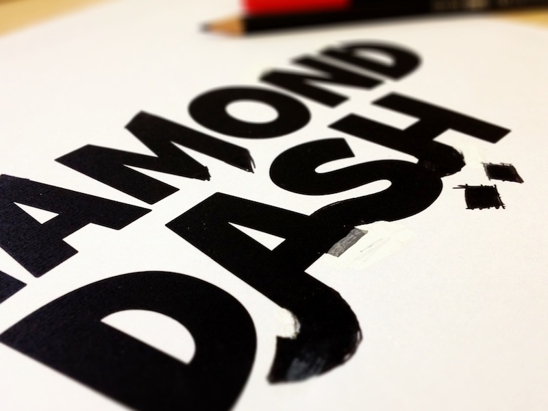
Left: Diamond Dash lettering process, classic pen on paper. Right: Early treatment variant with small diamond integrated into the wordmark
I decided to go for a bold and playful typeface, Grilled Cheese which we already used in the Wooga hit games Monster World and the iPhone version of Bubble Island. Slightly altered and added with some features from Arabian typography, it should resemble the game theme quite well while still standing out.
As usual for game logos, there are several other variants and iterations out there today, created by the amazing artists on the Diamond Dash team and the designers on the Wooga Graphics team. The key learnings however have remained and have been taken over to every other game logo we have built so far: strong contrasts, playful yet readable typography – soemthing that works on noisey backgrounds.