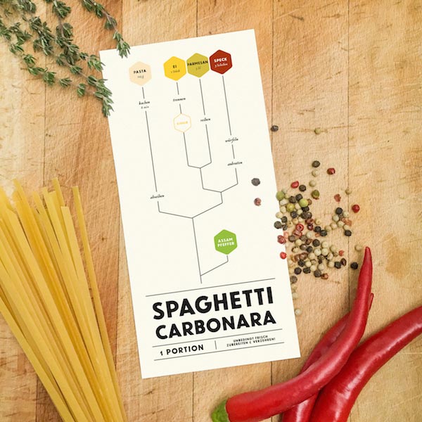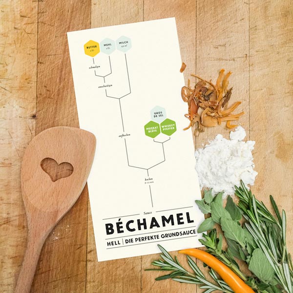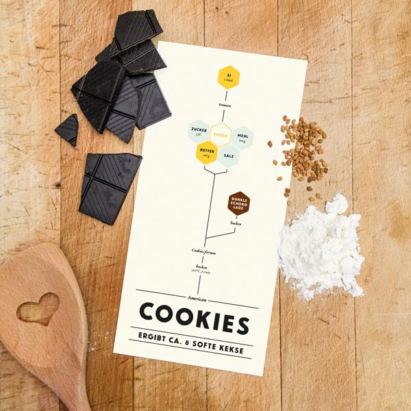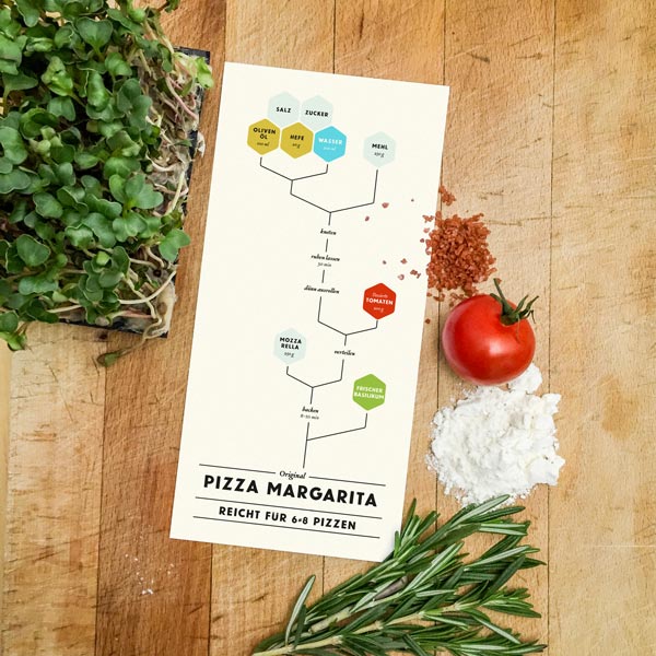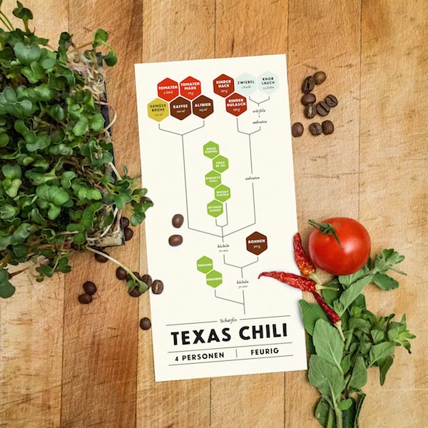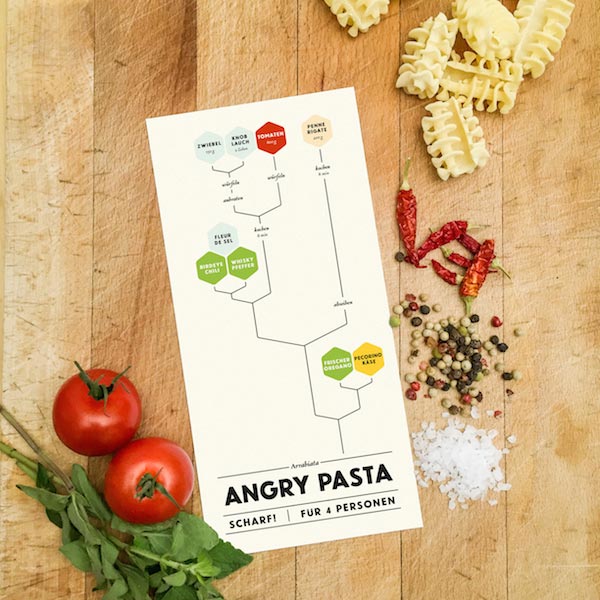

I like to cook. However, I've always been unhappy with the way cooking recipes were presented – so I made my own. This is the story of Graphical Cooking.
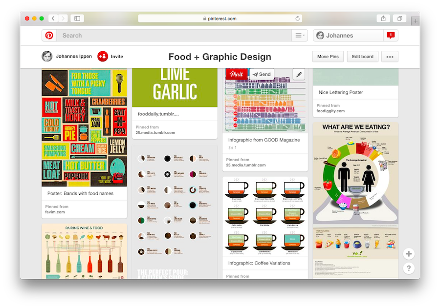
The idea of creating of visual cooking instructions aren't new. It's easy to find tons of cookbooks and websites that explain the steps in food preparation for kids and beginners with illustrations. What's been missing is away of visualising recipes in an approachable and memorable way for people who already knew how to slice an onion.
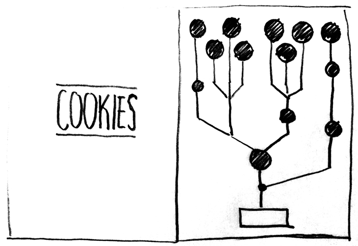
Recipes look like simple trees: Ingredients would start at the top, being combined in the middle and form a dish at the bottom of the infographic. Extremely easy to read, with as little words as possible. I created a couple of different recipes and put them up on Tumblr to get some feedback and try out different typefaces, shapes and variants of the basic idea.
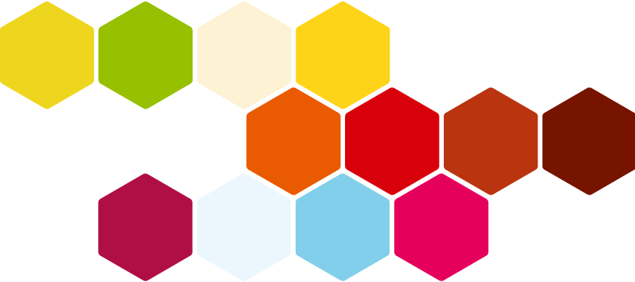
Each ingredient is represented by a hexagon filled with it's main color. A pairing of Newcastle from Facetype in Vienna and Georgia makes the recipes readable and stand out at the same time. The retro-look is no conincidence: The recipes should feel personal and empathic. Every time you cooked them, you should own them a bit more. They should be a bit more a part of you.
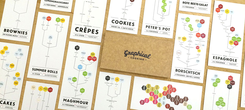
In end of 2014, I teamed up Nico at Thanksalot and we designed a beautiful hand-lettered logo and created 40 unique recipe cards, which we bundled an beautiful magnetic kraft paper box. With the help of Patrick from Spice for Life, we are able to offer the Graphical Cooking Recipe Box for purchase.
