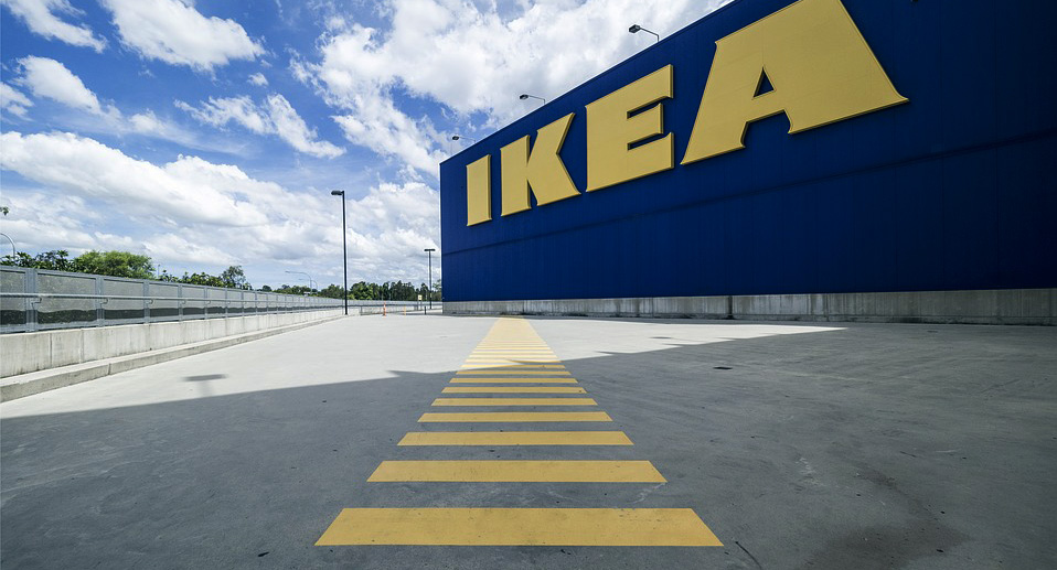
The IKEA Principle
Guiding users and creating experiences is more than only about fixed routes and agendas. It’s about having people coming to buy a shelf and going home with a dozen of candles and plants – and still not being unhappy.
If we want to look for great experiences, we need to extend our horizon – we need to look in the physical world. Why not learn from the big guys? The ones who have done this for some decades now? During my research, I discovered 7 essential steps in a user journey. They come from an e-commerce world, but they work very well in every situation where a user needs to convert somehow.
The funny thing: They all can be found in the way that Scandinavian interior giant IKEA has tailored their experience. So, let me invite you on a little shopping trip to our favorite Swedish furniture shop.
Phase 1: Clear the Stage
You park your car, eat a hearty lunch at the shop restaurant, visit the bathroom and sink your kids in the ball pit. Before the actual shopping mapping starts, you clear the stage. You prepare for the next 3 hours full of candles, chairs, and Kötbullar.
In the two-factor theory, hygiene is a factor that helps to prevent unhappiness, without being the central purpose. In other words: I’m not going to IKEA to visit the bathroom, but if I have the chance to, I’m definitely happier.
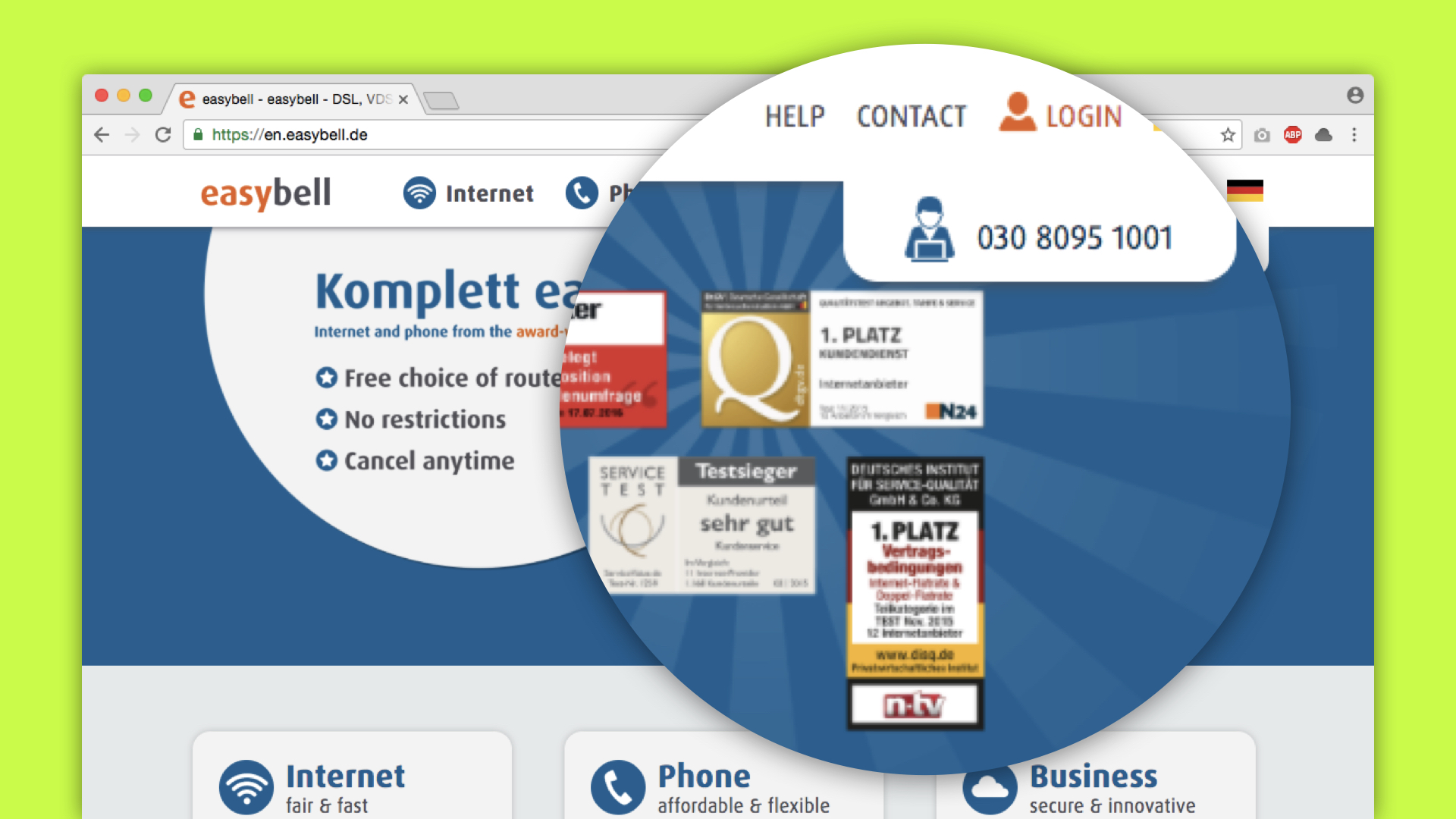
When experiencing digital products, hygiene can be found in the simplest forms. It can be the “Trusted Shop” seal in the footer, the full address and contact data or a simple chat window on the bottom of the page. The fact alone that I know what is going on and that I can trust this page help to clear the stage.
Phase 2: Inspire Them
Once arrived at the top of the escalator, you are being welcomed by a variety of model apartments. Small rooms, classy rooms, unusual combinations and bucket lamps filled with popcorn. Before you can actually buy anything, you will go through the inspirational exhibition part of IKEA.
The purpose is simple: To show you what you can do and achieve with the products and to give you a sense of the lifestyle.
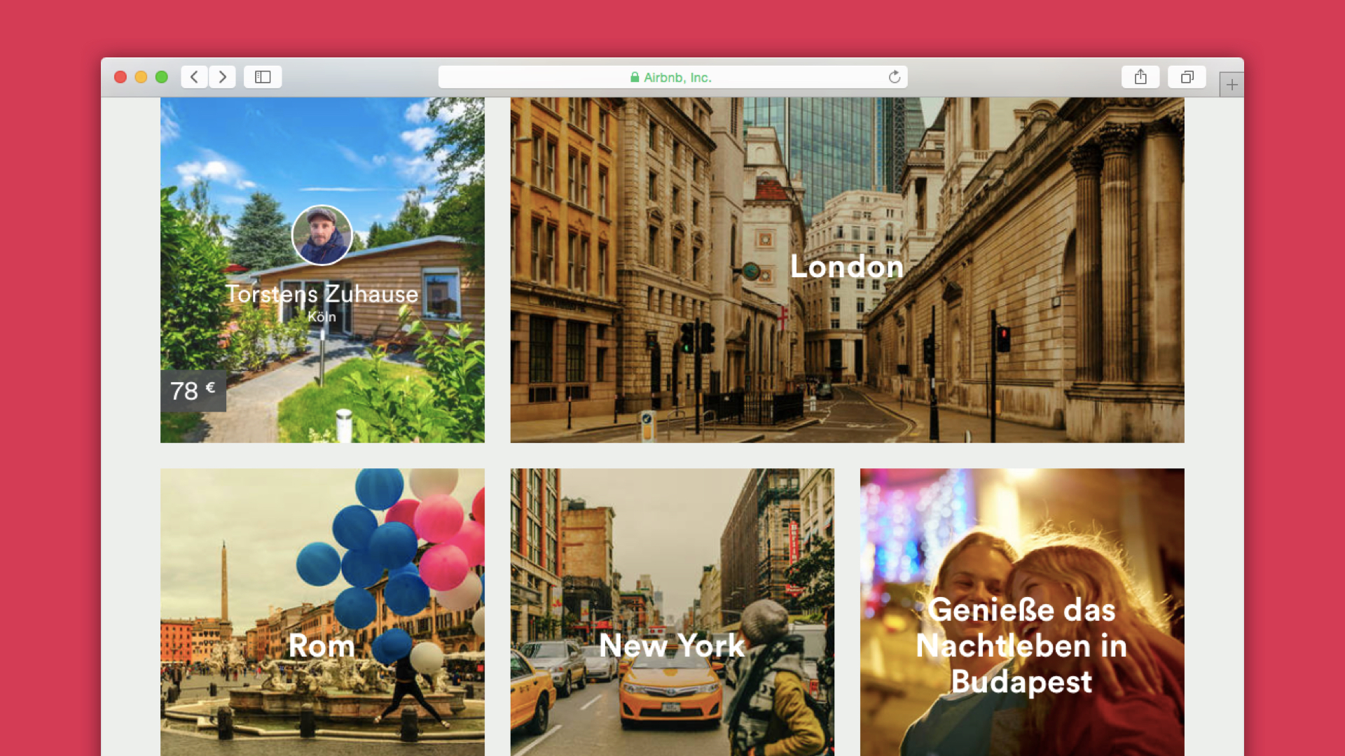
Fashion shopping websites know that very well: Most of them provide an Editorial area in which they show their clothing in context. The home page of Airbnb is a great example. Below the search, you can find inspirational sections. Telling you where to book your next vacation or recommending single hosts.
Inspirational sections on digital products can be of a great benefit for people to understand the products better. Even more: it helps to also to see them in action and get a sense of all possible usages.
Phase 3: Time for Decisions
When you are properly inspired, it’s time for the hard facts – decision time! Right after the inspirational exhibition, the lights get brighter, the chairs are not nicely arranged. Instead, they are put together in one shelf for better comparison.
Making qualified decisions can be really hard. The more information you give people, the easier it will be for them, the more likely it is that they will make a decision without further hesitation. Let them compare products. Tell them all the tech specs. Tell them what they get – and what they don’t.
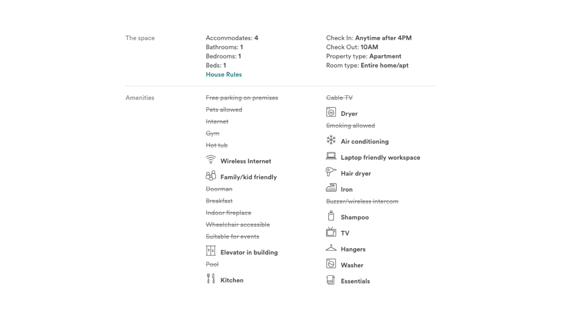
Airbnb does a great job, listing all the features an apartment has and crossing out the ones it doesn’t. In this phase, there is no room for surprises – either you have it, or you don’t.
Phase 4: Utilise Emotions
You’ve got them. Your user made a big decision, factored a lot of things in, maybe feels exhausted from it. Now it’s time to reassure them that what they made is actually the right decision. How so?
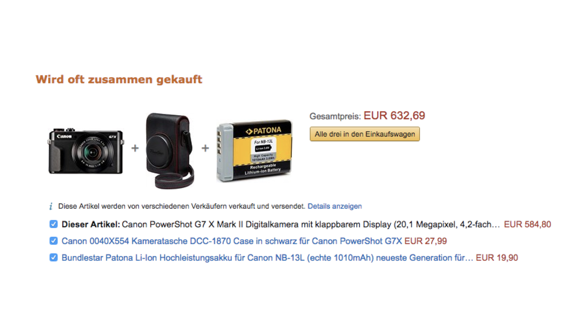
There are two essential ways to do this: The first one one is to appeal to their emotional side. At IKEA, the candles, plants and picture frames come after the big furniture – that is no coincidence. Adding decisions that are easier or more impulsive to make helps to justify the big decisions. Especially when they are somewhat related to the main decision: “Oh, this picture frame would go well with the new table I just bought.” Amazon will recommend you a pouch and an extra battery to the digital camera you chose. Now that I got some fitted accessories, the camera might be the right one already.
Back in the days, Apple let you engrave your iPod with a personal message for free – same principle. The emotional weight that comes with the personalization of your product makes the big decision seem more relevant than before.
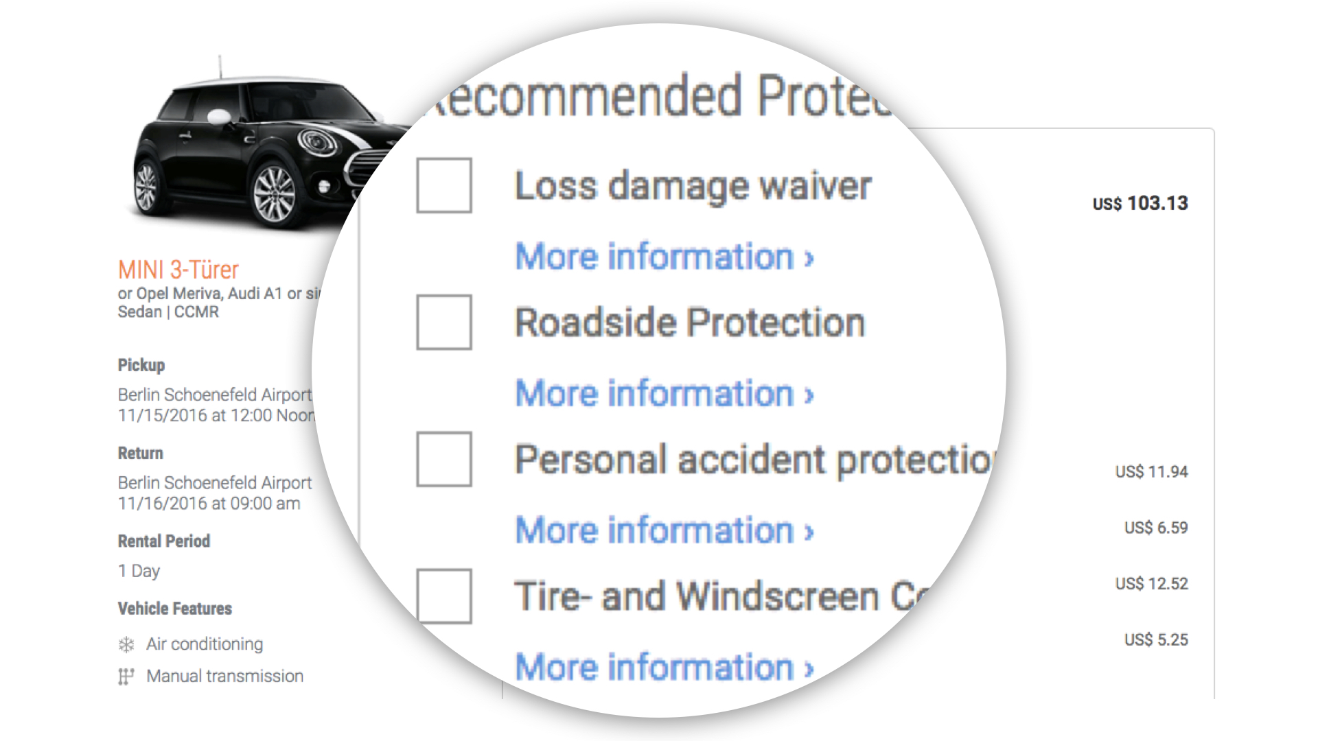
Emotions can also distract from the big decision. Car rental companies let you choose all kinds of scary sounding insurances right after you picked a fitting model. They could just include them in the price, but by making you pick if you want to protect your tires and windscreen, they take your attention away from the question if a smaller car wouldn’t have done it.
Phase 5: Let Them Touch You
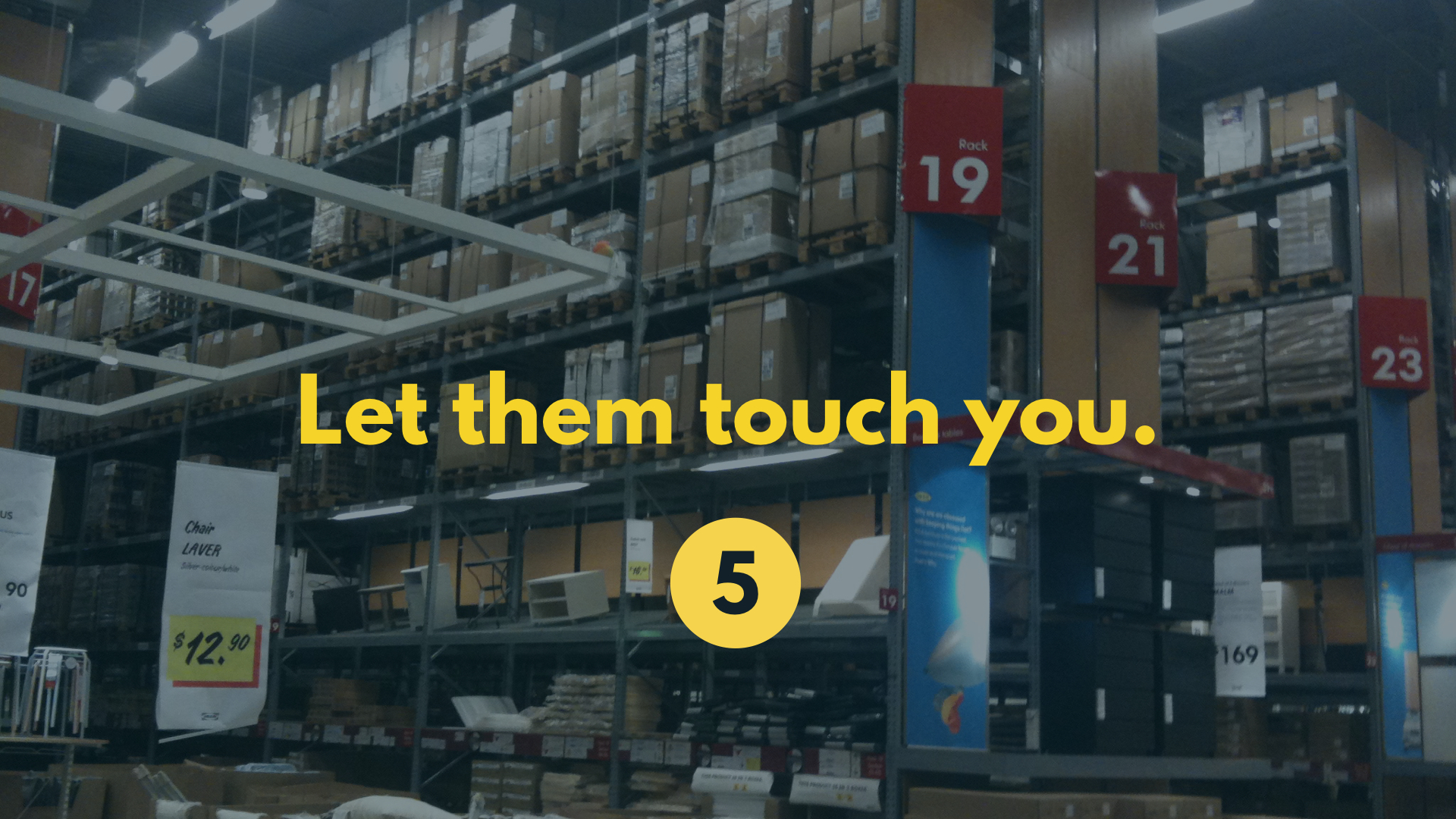
The second way is to appeal to their senses. Get them involved. Market research has figured that people who were able to touch a product are 4 times more likely to buy it. No wonder you have to pick the packaged furniture in the Swedish interior warehouse yourself. This does not only save money but helps to sell the goods.
How can we recreate this sensation in a digital experience? How can you make people touch products on the screen? Simple: send them a sample.
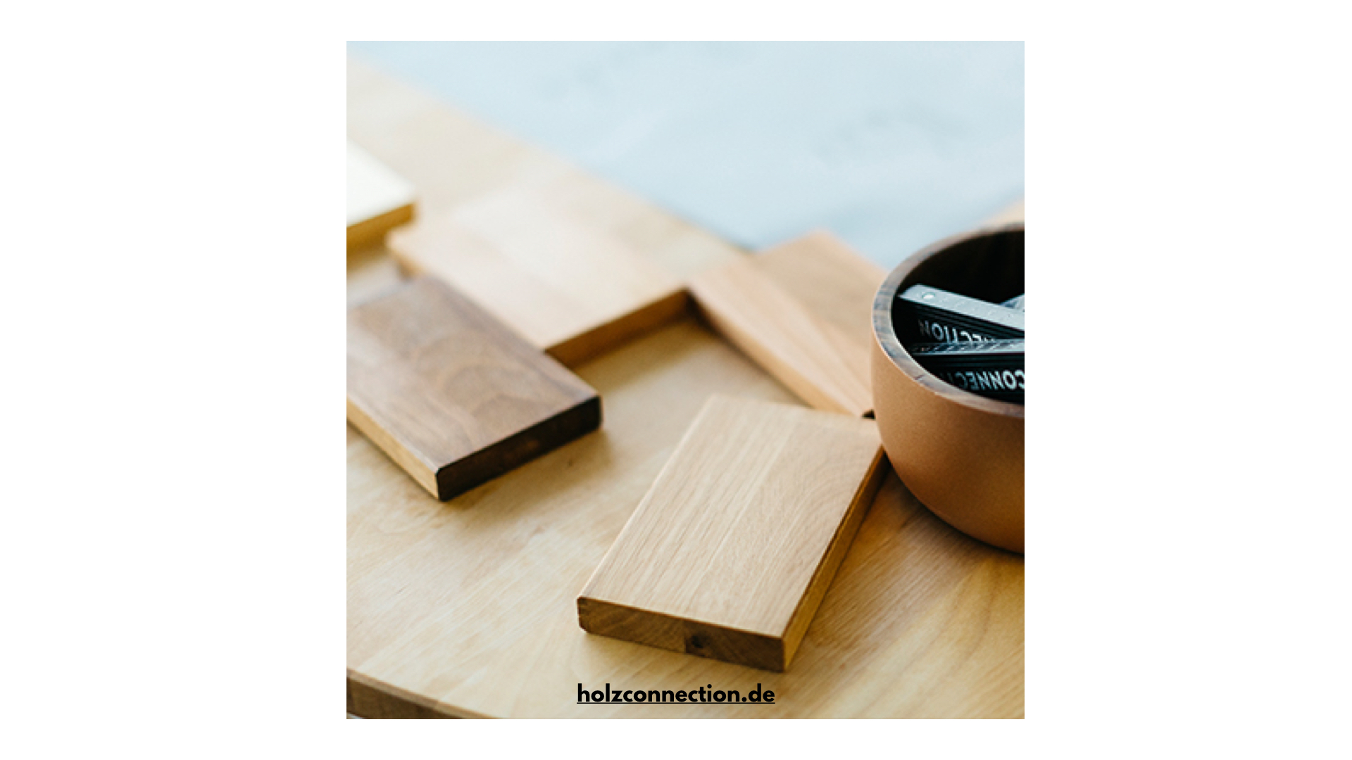
German online-carpenter Holzconnection will send you wood samples for free – no strings attached. While this helps you to ease your decision for which wood you want your new shelf to be built in, it also gives you a sensational experience. It also increases the likelihood of you using their service.
But not everyone can send out free samples: Mister Spex, an online shop for glasses, lets you try on their products through the webcam. While this experience is often more funny than helpful, it gives you a feeling of how it might be – and helps you build a connection to your new frames.
Phase 6: Make Yourself Hackable
Now here’s my favorite part: right before the cashiers, there’s the area where all the very cheap products are, and/or the ones with little defects – for much less than the original price. The importance here is not the actual savings, but the fact that you can save something, the fact that you can “trick” the shop.
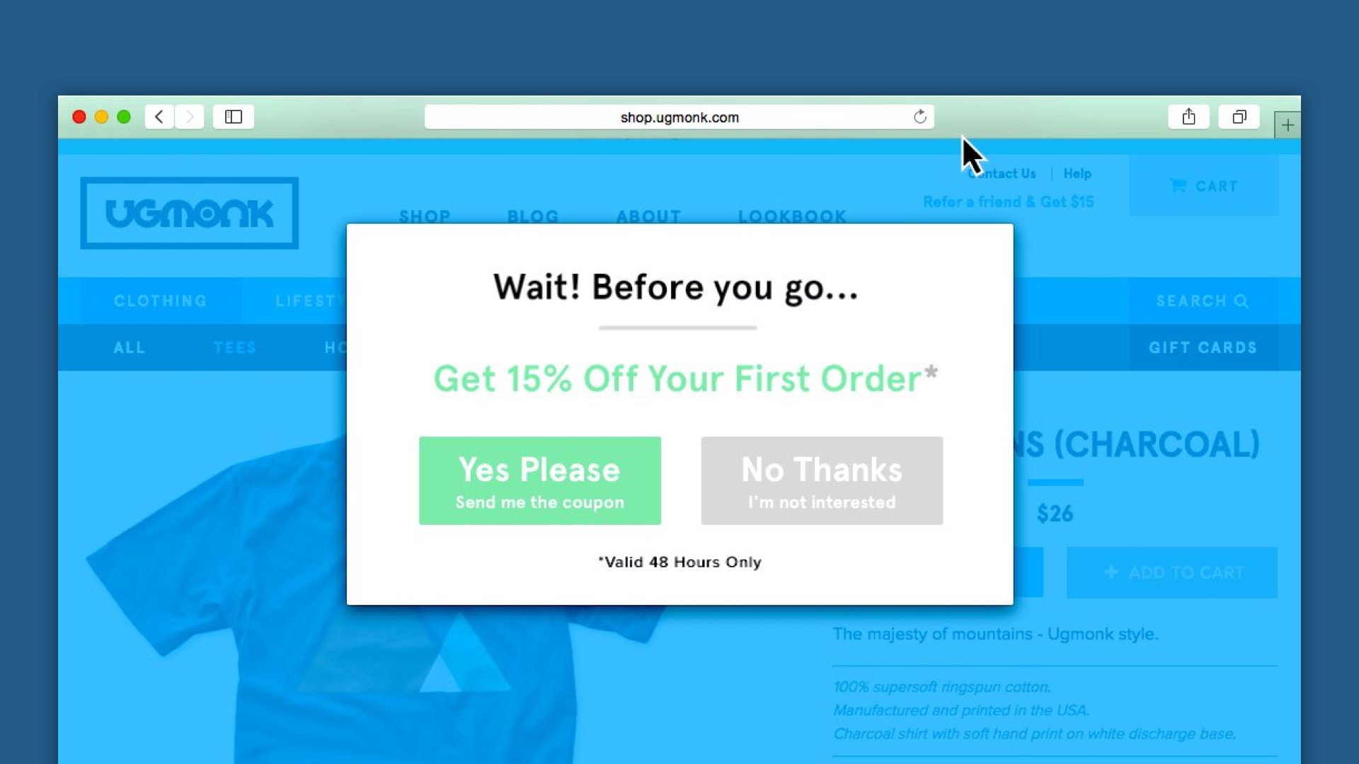
An implementation of that I really dig can be found on a couple of digital shops today. Right before you move the mouse out of the browser window to visit a new site, it will display you a modal, giving you 15% discount. How great is that?
Phase 7: Reward
Congrats! You’ve made it! Time for a little celebration – how about a Hot Dog? You guessed right, those delicious cheap sausages after the cashiers are not only there to nourish exhausted shoppers. They are a reward to the successful shopping experience. Just like Mailchimp’s “High Five”, after you sent out an email campaign. It might seem simple and self-evident, but sometimes saying “well done” or “good job” can actually help to leave people with a good feeling!
Seven simple steps – and these are just a few examples of how the IKEA principles can be implemented in a digital space. There’s more! Check my Creative Mornings talk and my book, “Web Fatale”, to get a bigger picture.
–
What other things do you think are important? What is your experience with IKEA visits and online conversion experiences? Let me know on Twitter – I’m really curious! I hope you liked this article, thank you for reading!
Disclaimer: This post is inspired by the great work that IKEA is doing, however not paid by or in any way affiliated with Inter IKEA Systems B.V.